
A Brutalist-inspired home: $100k Renovation for a 1-bedroom condo in Robertson Quay
“I really like Brutalism–that kind of geometric, hard shapes…The organic and inorganic; that kind of melding of the two–I love that aesthetic.”
By Shannon Osztonits -
Share this article
In today’s times, too often are we exposed to utter perfection: life with permanent filters, where the real nitty-gritty is often masked.
A refreshing sit-down with homeowner Daryl Lee was a reminder of how to embrace the imperfect. As someone who really appreciates the Brutalist movement, this translates into his Robertson Quay home.
“I love the molding of concrete and wood. My glass dining table and then wood running across the entire home. Structural and industrial; it speaks to me on a certain level, and I’m not even really sure why,” he says.
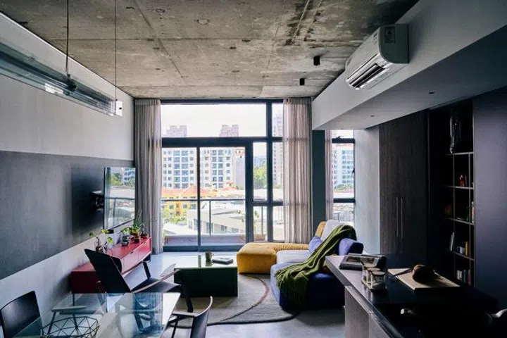
Going against the grain: ceilings are exposed to create an industrial feel; there’s a clear mix of raw and natural materials, such as glass, concrete and wood, and one of the primary colours you see throughout the home is three varying shades of grey.
“The brief was clear: bold, conversational, and functional,” says the interior design studio Artistroom. “Inspired by Brutalist interiors, the client wanted an expressive and tactile space, ‘raw but refined,’ with a backdrop that could complement his collection of pop-coloured furniture and art.”
Adding to this, Daryl shares that: “I like things that are mismatched, a little bit of imperfection and eclectic colours. I really think I couldn’t have done half of this stuff without my interior designers, Mark and Katy. I also like to think I know when something is “nice” when I see it. Now, my girlfriend and I see our home as our refuge; our cosy space.”
Background behind Brutalism
The movement was popularised circa the 1950s, shortly after World War II ended. Its name originates from the French words ‘béton brut,’ translating to ‘raw materials,’ which is the foundational premise of the style.
Think striking geometry (limited curves), functionality, organic materials, bare design elements and a distinctly monochromatic colour palette–charcoals, ash, and chalky whites–as well as heavy Earth tones.
For example, the home features three shades of grey: a very dark grey near the foyer and entrance, the grey middle wall strip running through the length of the living and dining room walls, and then the grey lightens up the moment you step into the kitchen area.
Who Lives Here: A Singaporean in his 40s who works in marketing and his girlfriend
Home: 1-bedroom Condo
Size: 800 sq ft
Interior designer: Mark and Katy from Artistroom
Whilst this is Daryl’s second home-buying and renovation venture, it’s also his second time working with the Artistroom team. After a super successful first project together, choosing to work again with Katy and Mark was an obvious choice for him.
“For this home, I didn’t start with much of a vision. But how I kind of worked with this is that I knew I wanted it to be Brutalist (that industrialist kind of look, to a certain extent), but no other requirements beyond that. Being the wizards that Katy and Mark are, they kind of just got me, and it’s one of the reasons I thoroughly enjoy working with them,” the homeowner explains. “From working with them prior, they understand my aesthetic.”
Although Daryl swore to himself he’d never undergo a full gutting after his first, once his interior designers showed him a full rendering of what they envisioned for his second home, there was no other option but to say yes!
“When Mark and Katy came back with the first draft, I said I don’t think I could live any other way. It didn’t start out that way when I bought the property, but here we are,” he says.
“This project is a continuation of a meaningful relationship with a repeat client, whose first home we had the pleasure of transforming a few years ago,” tell the interior designer duo.
“Seeking a home that matched his evolving needs, he moved to this location for a more spacious layout and proximity to work. Like his previous home, the existing layout was too compartmentalized and didn’t suit his lifestyle. Walls were gutted to open up the flow and bring the living, dining and kitchen spaces together.”
The reconfigured kitchen
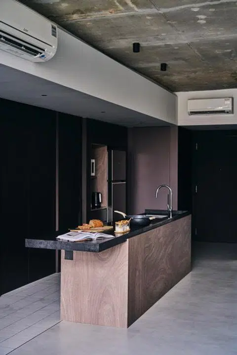
Maximising the condo’s space, the design team converted the old kitchen into the home’s now-storeroom and parts of the yard, pulling the current kitchen forward, directed around an island as the main focal point and the kitchen’s structural element.
“At the heart of the reconfiguration is a striking open-plan kitchen, complete with a central island that anchors the home both visually and socially. This space now serves as the perfect stage for gatherings, balancing comfort with architectural impact,” say Mark and Katy.
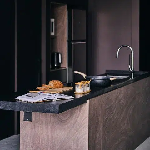
They seamlessly integrated cabinetry and storage below the custom-built island with its black sintered stone counter. Along here are the sink and stove, with the oven concealed beneath.
“One thing Katy and Mark are really good at is hiding things. What you think is solid wood, like the bottom part of the island, is actually storage,” details Daryl.
Custom-built chocolate brown coloured cabinets were placed behind the island, along with the fridge and pull-out pantry. The couple was attracted to this shade because in a certain light, it leans towards a maroon colour.
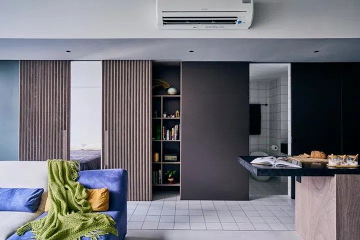
The colour extends to the front entrance. White unembellished square block tiles run through the kitchen, into the halfway section, bathroom and to the rear end of the living room.
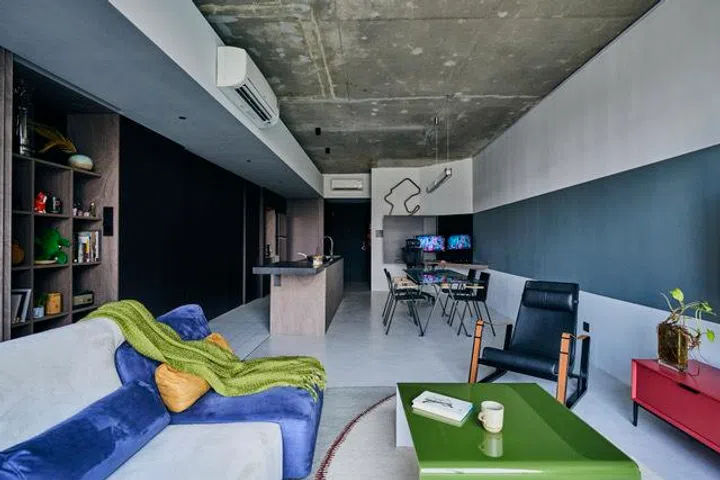
A living room with geometric furniture
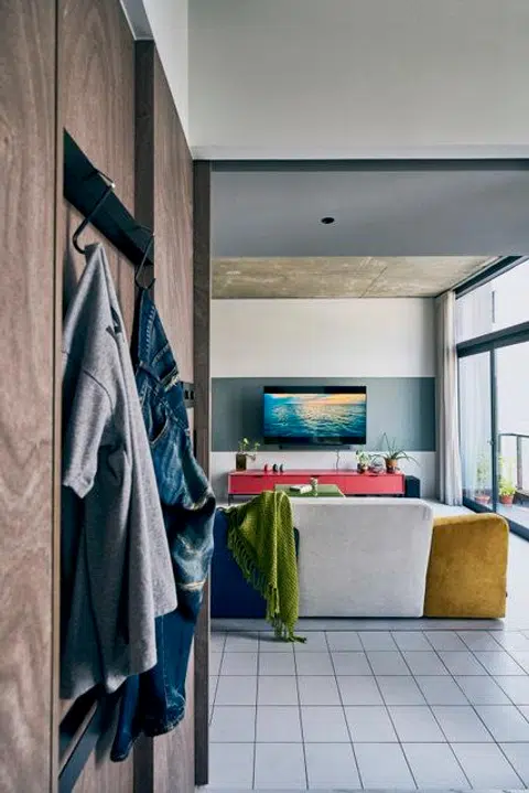
The homeowner’s furniture selection for the living room reminds one of a Piet Mondrian artwork, featuring primary colours like blue and red. Its masculinity mirrors the Brutalist image, enhanced by the microcement-finished floors.
“I love the pieces that I chose. The coffee table, the sofa, the rug. They are very deliberately chosen, and I kind of knew I wanted those in curating the space. That’s how I do the design in general…Find furniture items that I like and then design around them,” says the homeowner.
The three-piece modular sofa (from Ligne Roset) is Daryl’s ultimate happy space in his home, falling asleep here more times than he can count. The irregularity of its geometric shape is a look he was after when couch-hunting.
A striking green Studio Sovet Collection coffee table quantifies another delicious pop of colour, especially when paired with the wooden red TV console. The structural leather Vitra occasional chair suits the living room’s overall aesthetic.
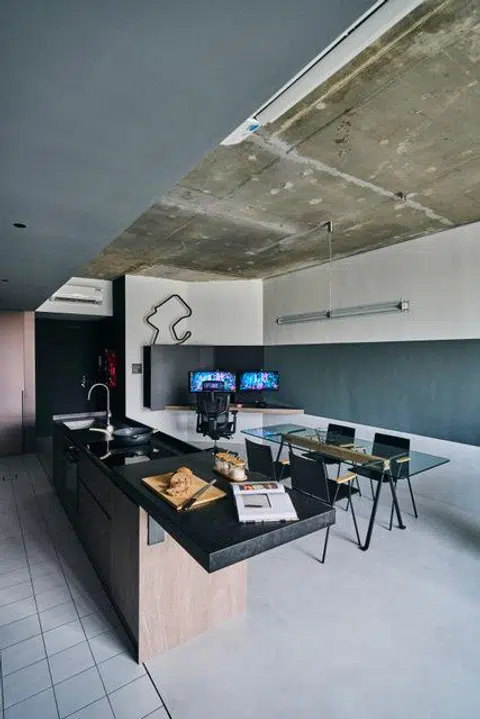
A dining area centred around glass
Daryl’s glass Driade dining table was one of the pieces that he chose in the early days, which somewhat inspired his pull towards the home’s overall aesthetic, he tells Home & Decor. Like the rest of the design elements that you see, the Pedrali dining room chairs also boast a structured dimensional quality.
An exposed pendant beam hangs across the table. To the side of the dining area is a dedicated gaming station for this avid gamer–who, in his older years, prefers playing single-player narrative games.
Mark custom-built the triangle-shaped table, where his monitors sit.
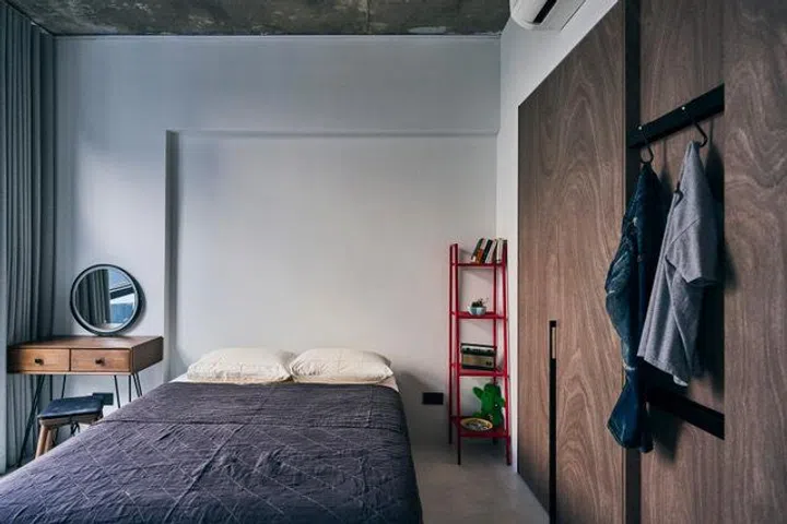
A minimalist master bedroom
Whilst the primary bedroom is not completely bare, it does stick to the Brutalist principles of functionality and is pretty fuss-free.
To enter the master, the design team placed two ribbed brown-veneer sliding doors–the same wood veneer as the kitchen counter.
“I like that pyramid-looking design of the wood; it adds texture to the place,” tells the homeowner.
Originally, the primary bedroom comprised an en suite with a bath, but finding no use for it, Daryl had the team strip this out, close off the en suite, and instead build a small walk-in wardrobe.
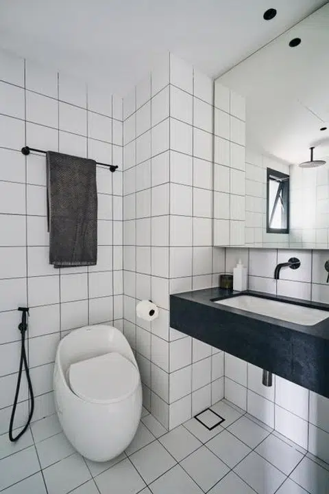
A white and black-accented bathroom
Now separated from the master bedroom, the home’s bathroom is also located along the hallway, between the primary and the service yard.
A continuation of the white block tiles into the bathroom matches its overall white colour palette, with black accents chosen for parts such as the vanity, sink, window frames, and other bathroom accessories for the shower and toilet.
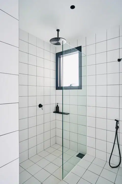
The bathroom’s countertop and soap ledge are constructed from the same black sintered stone as the kitchen counters. Above the vanity is a mirror doubling as storage behind it.
Forgoing an ordinary toilet, Daryl’s egg-shaped one was a purposeful buy.
“I wanted something unconventional for the toilet, so I ended up with this one. It was chosen for its aesthetics more than anything else.”
Carefully curated storage integration
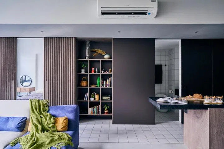
“One of the biggest lessons I learned from my previous home was to have as much storage as possible and provision for it,” explains the homeowner. “The first time round, I ran out of storage, especially for the kitchen.”
For this renovation, carefully curated storage was a biggie. Across the hallway, Artistroom built and installed storage cabinets that can be opened up for display or hidden behind the chocolate-coloured doors.
“Strategic storage solutions were seamlessly integrated into the design, maintaining the minimal and clean lines demanded by Brutalist sensibilities while addressing everyday functionality,” detail Mark and Katy.
A non-rushed timeline
After looking at multiple properties, Daryl admits that his home wasn’t actually his first choice.
“It sounds unromantic to say, but it’s the one we liked the least.”
However, after hearing solid, resounding advice from a friend of his who happened to be a property agent, he realised that this condo offered him the most freedom with a square space.
“My friend was saying that when you’re deciding on a property or any kind of big purchase, it’s not so much the number of green flags that a place gives you, but the least number of red flags a place gives you…And I think this place gave me the least red flags. It was in a central location–which was important. More than anything, I wanted a square place I could do things with. And I liked the floor plan a lot. I am glad I took his advice”
Thereafter, the design process took three to four months. In no real hurry to move in, Daryl wanted to rather do things right than have it rushed, and the construction works were complete in 10 months.