
A couple’s quirky home filled with colours, Shiba fur and a huge dose of humour
This fun and colourful home was designed around things that make the couple go Wow and their dog go Woof!
By Lynn Tan -
Share this article
Who Lives Here: A couple in their 30s and their pet Shiba
Home: A 5-room HDB flat at Woodlands Drive 14
Size: 1,356 sqft
Interior Designer: Threehaus Works
“You just know it” is how homeowners Samuel and QiQi, who are in their 30s, describe their house hunting experience. This 5-room HDB flat is their first home together and they were looking for one that vibed with them and which they could see themselves growing old in.
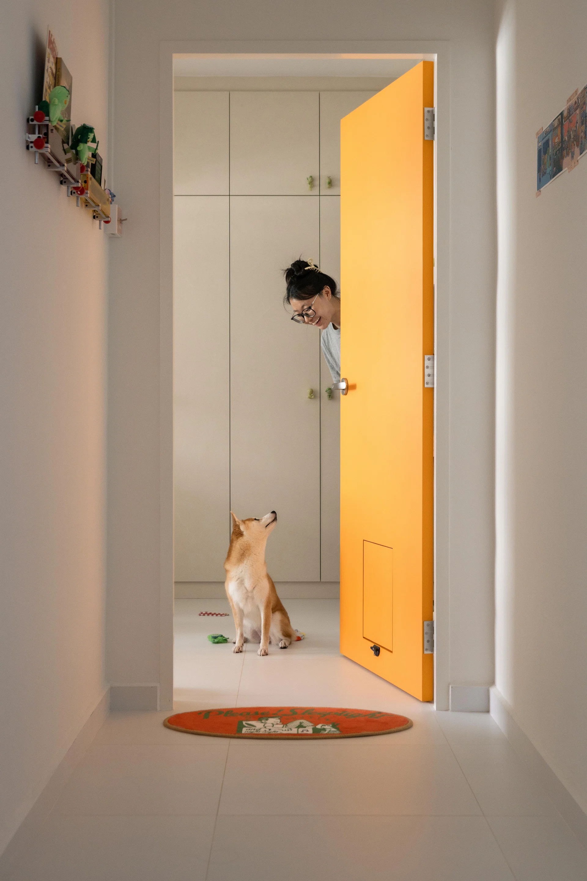
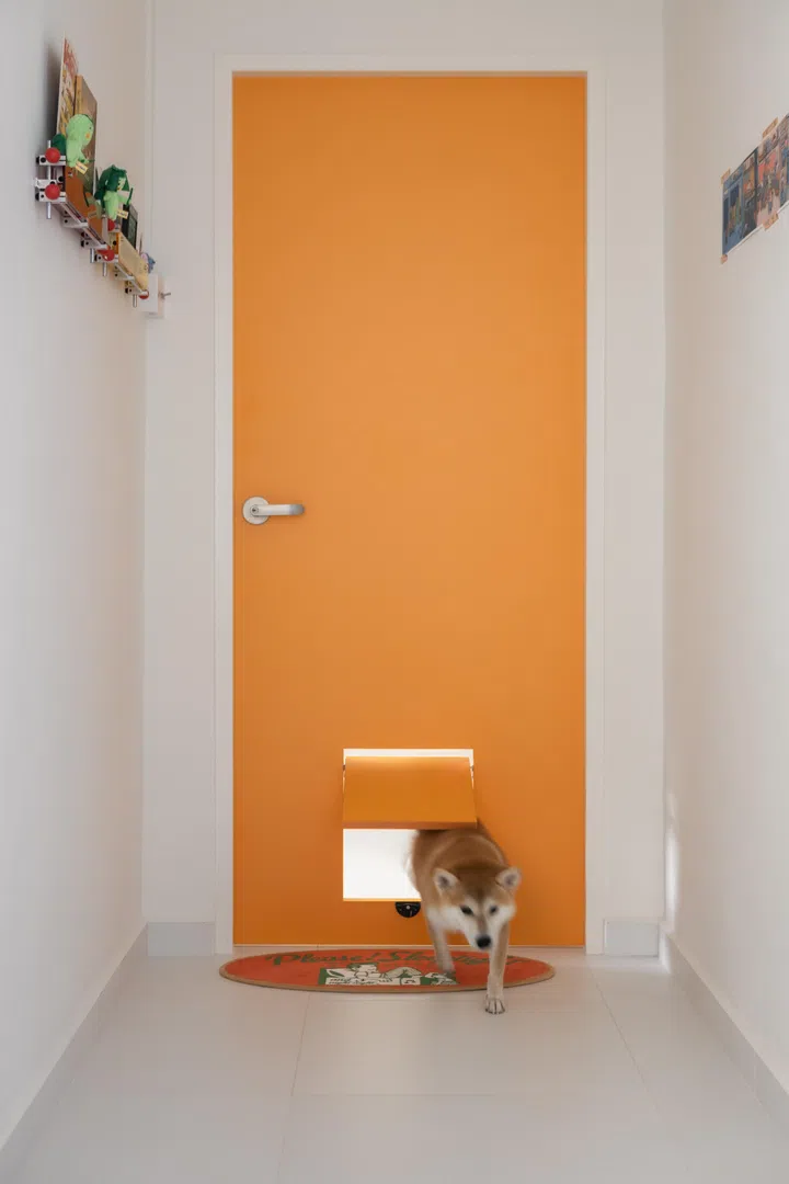
Samuel works in IT and his mantra is: “Have you tried turning it off and on again?” QiQi is a marketing data analyst consultant and they share the home with their Shiba, Kiko, also affectionately referred to as “ruler of the household, watcher of the neighbourhood, napper of all afternoons, sunbather of warm patches, supervisor of all things that require zero dogs, and barker of delivery parcels”.
It is their vivacious personalities, rather than a fixed style or theme, that the home was designed around. It is about things that they like and it allows them to fill the home with more things that they like, just like a blank canvas.
Threehaus Works Interior Design
As Threehaus Works interior designer, Jax Ren, puts it: “We did not want everything to match perfectly. A lot of the charm comes from things being a little unexpected next to each other. The fixed parts of the home are really just the framework. The house becomes more ‘them’ through their furniture, artwork, toys, prints and all the random things that they continue to add.”
Showing their true colours
The couple had the idea of using primary red-blue-yellow colours and along the way, orange also became part of the colour palette. There was no hard and fast rule, just a more relaxed, laissez-faire approach.
“If there is too much red, we do blue, and if there is too much blue, we do yellow, and so on,” says homeowner Samuel. Interior designer Jax let his intuition take the lead and when he felt that one colour was starting to dominate, he would balance it with another hue.
Although the home comes across as being colourful, the big surfaces are actually quite calm- white walls and tiles, light grey floors, raw concrete, timber, and stainless steel. More than just aesthetics, Jax used colours as punctuation and for wayfinding.
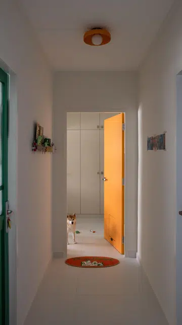
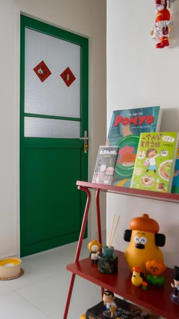
“Instead of painting every big surface a strong colour, we put the stronger colours on doors, frames, thresholds, exposed pipes and certain pieces of carpentry. So the blue wall and yellow door tell you where the kitchen is, while the different coloured doors along the corridor give each room its own identity,” he explains.
An important decision was to have the new full-height window frames in white instead of dark bronze. Due to the prominence of the windows within the living room and study area, the dark bronze frames would have been overwhelming. Having them in white helps to make them visually disappear and allows the rest of the colours to come together more harmoniously.
Entrance foyer
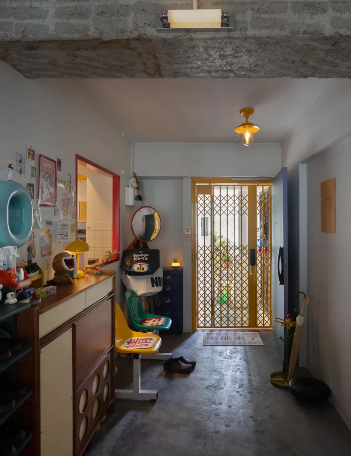
Not just another nondescript entrance along the common corridor, a bright yellow gate welcomes visitors and announces to everyone QiQi’s favourite colour. The existing storeroom was removed to widen the former corridor-like space to create a proper entrance foyer.
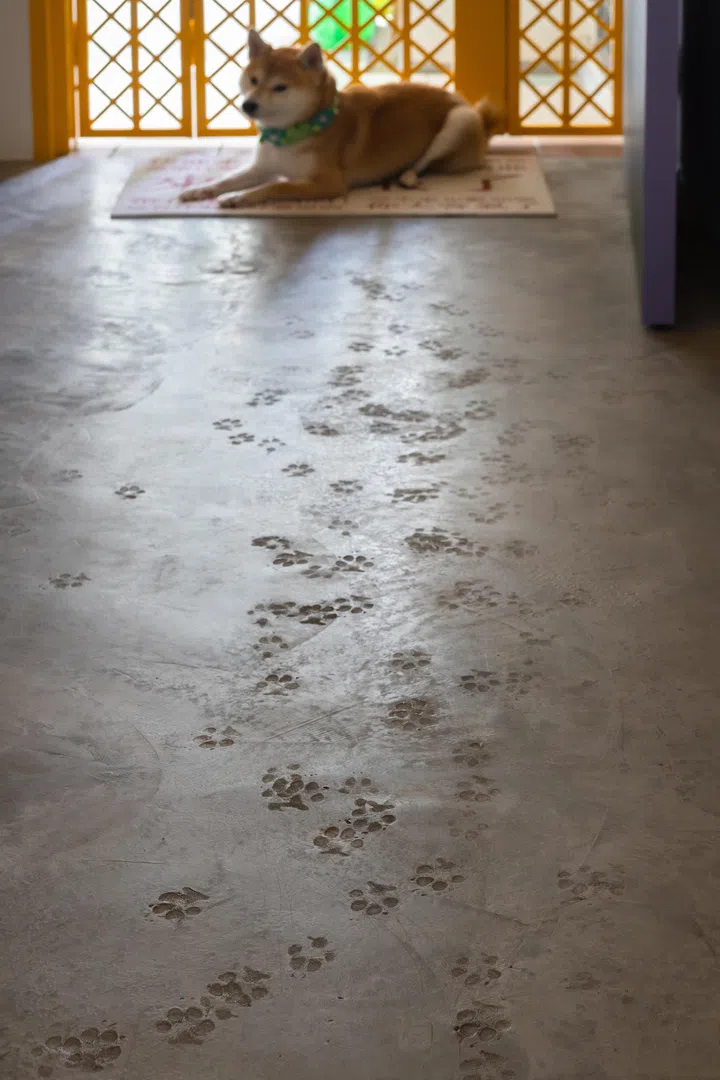
A trail of Kiko’s paw prints leads from the gate into the home. Samuel and QiQi got the idea when they noticed accidental paw prints on the road pavements and thought that it would be a cute feature to incorporate into their home and have Kiko be a part of it.
The cement floor strikes up a dialogue with the exposed concrete beam above and they make up a neutral backdrop against which the colourful palette can stand out.
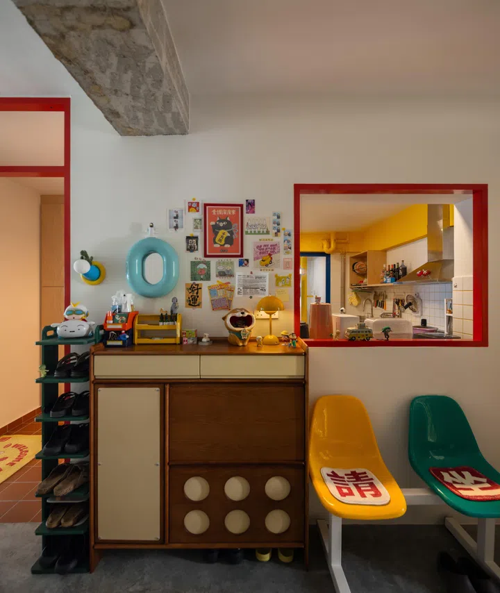
To the right of the main door is a pair of yellow and green old school chairs that remind the couple of their childhood. These sit beside a vintage timber cabinet that gives the entrance foyer a retro feel that does not feel over designed.
An opening has been created in the wall between the foyer and the kitchen. Outlined in a red frame, it offers a peek into the goings on in the adjacent kitchen from the foyer.
Kitchen
As the couple cooks fairly often, the kitchen was an important part of their brief. They wanted to accommodate a gas range, built-in oven, microwave, dishwasher and ample storage. The idea of an open concept kitchen appealed to them, but with all the frequent cooking, a semi-enclosed design would be more feasible.
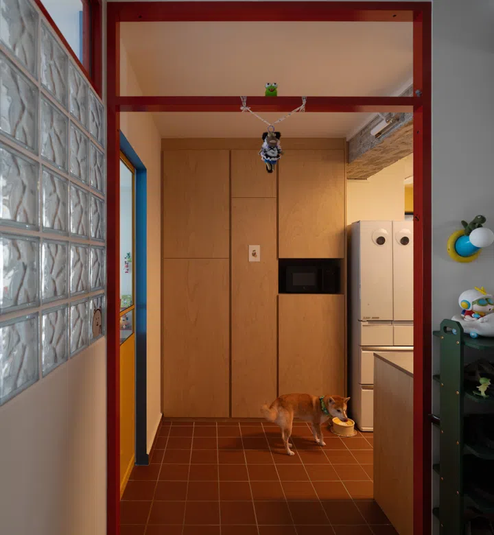
A red doorway echoes the red window opening and leads from the entrance foyer into the kitchen. The kitchen is also accessible from the dining area via a yellow sliding door set against a blue wall.
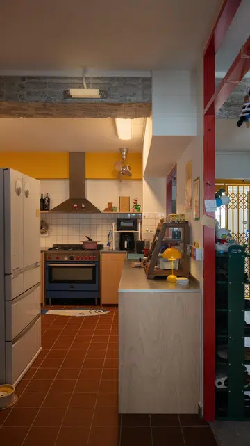
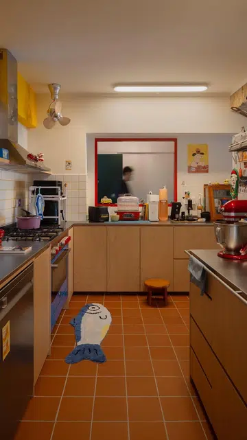
To balance these strong colours, Jax toned down the colours in the kitchen itself, but played up the contrast between different materials and finishes instead - from the terracotta-coloured floor tiles and wood grained cabinets to the white backsplash tiles and stainless steel counter tops.
Living room
The full height windows are one of the key features of the home and the star of the living area. Replacing the old windows with these floor-to-ceiling ones posed quite a challenge. It involved a fair amount of co-ordination with HDB and approval from BCA, which added to the renovation duration.
The windows were installed only on the actual handover day itself. However, looking back, it was all worth it because the windows allows plenty of light into the home, as well as offer views out. “Kiko really likes to ‘kaypoh’ and the full height windows give her full access to her day job of being a snoop,” says QiQi.
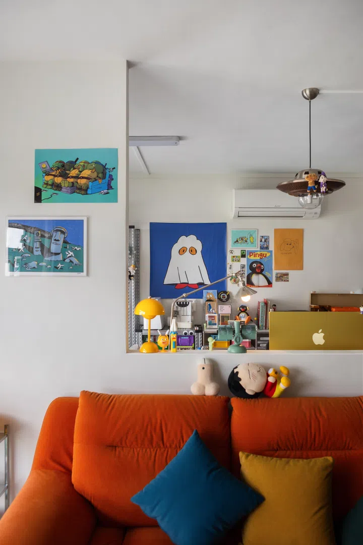
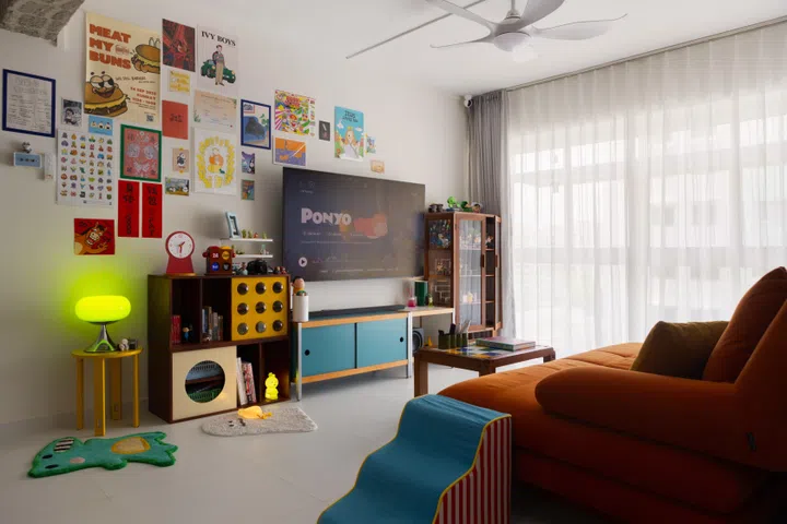
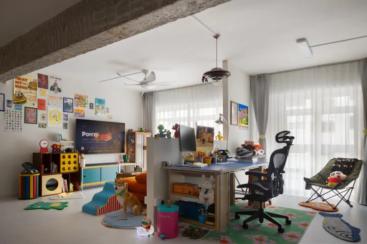
To complement the full height fenestrations, the rest of the living room was deliberately kept simple and neutral, with minimal carpentry so that the couple can switch things around easily. However, the vibrant colours and personalities of the home and homeowners still come through in the assortment of furniture, rugs, lamps, prints and other objects from their collection.
“We collected these things over the years when we travel or come across items that we like and in the recent two years, a lot of them have been collected with the thought of ‘I think this will look nice if we put it up in our house next time’,” shares Samuel.
QiQi’s work area
Both Samuel and QiQi required dedicated work areas within the home and this space behind the living area is QiQi’s. The existing wall between the living room and original study was hacked and replaced with a low partition wall that offers some degree of spatial separation without being totally cut off from the rest of the space. It provides QiQi with a defined work area that also enjoys the natural light and view from the full height windows.
Another beam was revealed with the removal of the original wall. Continuing the same approach as the beam above the entrance foyer, interior designer Jax decided to leave it exposed and raw instead of boxing it up, which adds to the character of the space.
Dining room
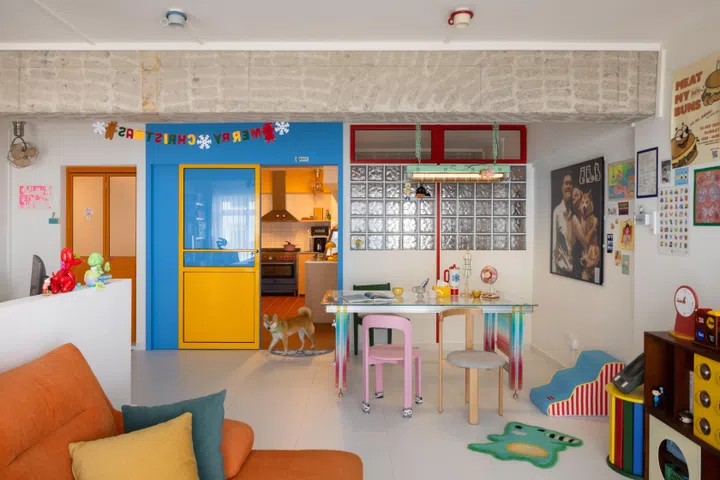
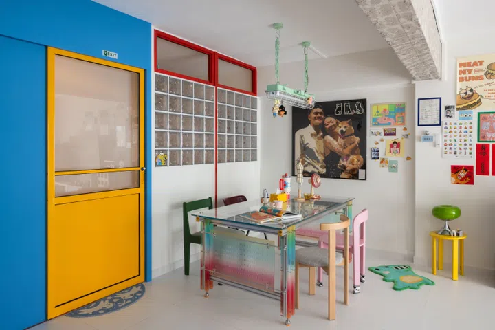
There are a lot of colours happening in the dining room, but interior designer Jax managed to make it work by keeping the walls and the floor light and monochromatic. There is a red-framed glass block wall beside the blue and yellow wall and door that separate the kitchen from the dining area.
The dining table is not your run-of-the-mill variety, but a custom piece by an acrylic manufacturer. The colours on the table legs are not just coated on the outside, but dyed into the acrylic material itself to create a unique ombre effect.
The colours are a blend of the various shades around the home and brings the whole palette together in one piece. The mismatched chairs are characteristically Samuel and QiQi, who loathe uniformity. It is not just the chairs, but they try not to have any repeats in the rest of the furniture, lights and other items around the house.
Master bedroom and walk-in wardrobe
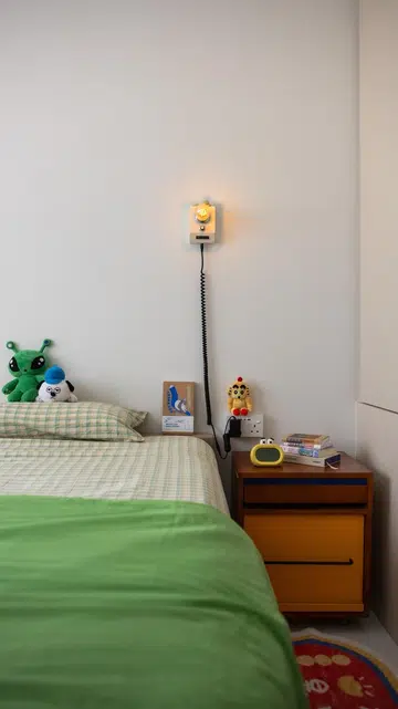
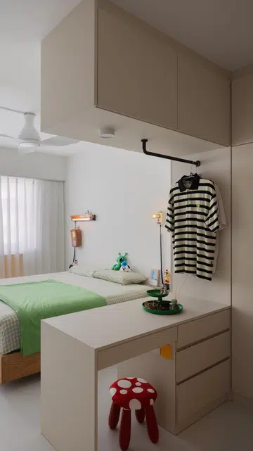
Compared to the rest of the home, the master bedroom has a calmer ambience. The key pieces of carpentry adopt soft beige and stone grey tones, which let the couple’s furniture, bedding and other personal artefacts tell the story.
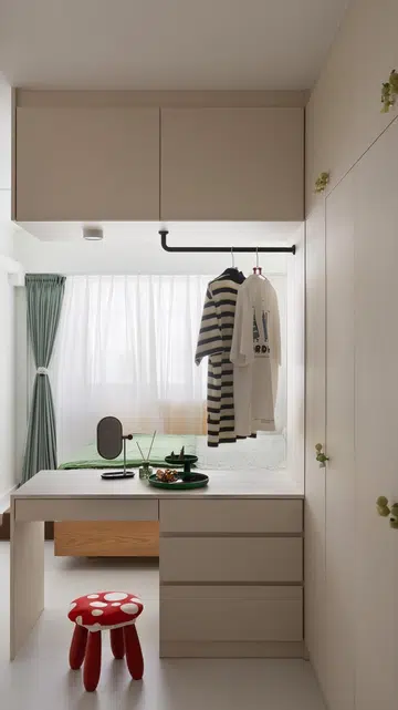
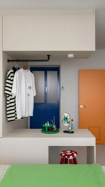
The walk-in wardrobe and dressing area are defined using the built-in carpentry. This approach maximises the efficiency of the bedroom floor area. The wardrobes extend the full height of the bedroom, while the vanity projects out perpendicular to the wardrobes, like a peninsula.
An open hanging rail directly above the vanity caters to outfits that the couple wear more often or are planning to wear the following day. Instead of conventional wardrobe door handles, they opted for glow-in-the-dark, collectible Smiski figurines, just another example of the couple’s sense of humour.
Samuel’s study
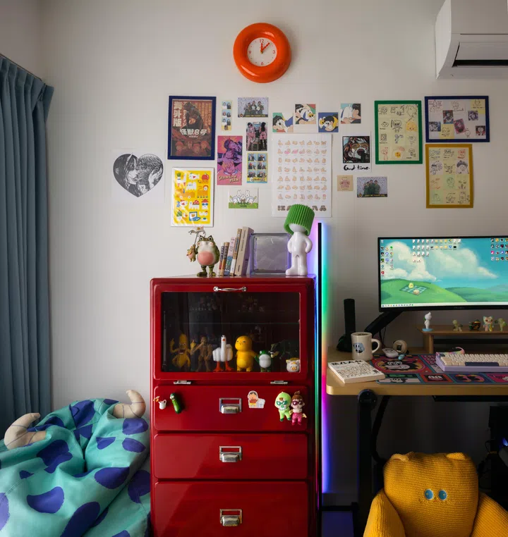
One of the bedrooms is now Samuel’s personal study and also where he can chill out. The cabinet and walls are filled with his own collection of figurines, posters, prints and other knickknacks. Apart from the work desk, there is also a sofa bed that allows the room to be converted into a guest room when necessary.
Bathrooms
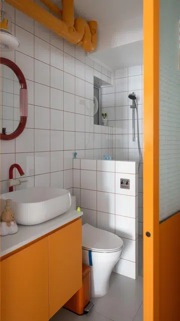
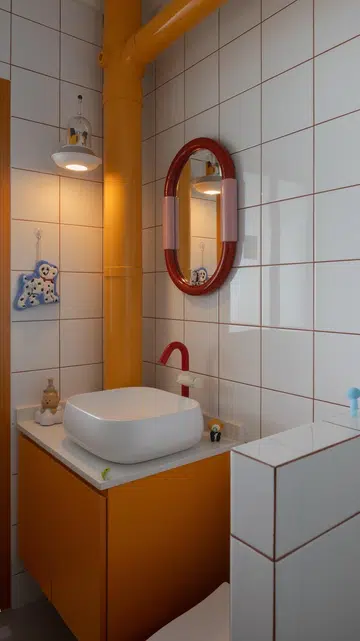
The common bathroom continues the playful theme of the home. Pops of orange in the door, door frame, vanity cabinet and pipes stand out against the white tiles. A half-wall parapet segregates the shower compartment from the rest of the bathroom without making it feel too cramped.
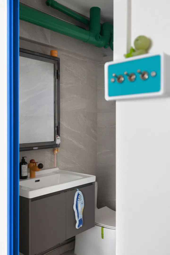
In contrast to the common bathroom, the master bathroom is more subdued. Jax used grey toned tiles and darker fittings as the base, then painted the exposed pipes green and added a blue door and frame. “There is still colour, but it is much quieter,” he comments.
‘Furever’ home
The couple spent about $110,000 on the renovation, plus another $160,000 or so on the furnishings and appliances, but they estimate that the actual figure is probably higher as they have since purchased a lot of other things for the home. With the 11.11 sale around the corner, they already have their eye on a new television set for the master bedroom, as well as a few other furniture add-ons to supplement their daily habits.
This is the first and possibly ‘furever’ home for Samuel, QiQi and Kiko. “We are pretty laid back home bodies in general and the thought of packing our things up and moving again scares the hell out of us, to be honest,” QiQi admits. Since moving into the home in mid-September 2025, the threesome have settled very nicely over the past year. “It has been great so far with the newfound freedom of being able to leave plates in the sink to wash later and not vacuum the floor for a couple of days and there is no one to nag at you,” says Samuel.