
This photographer & lecturer couple’s 4-room HDB in Bedok North was inspired by Charles & Ray Eames
This couple was inspired by American designer-couple, Charles and Ray Eames’ house when putting together their version of a Mid-Century Modern home.
By Lynn Tan -
Share this article
Who Lives Here: A photographer and lecturer couple
Home: A 4-room HDB flat in Bedok North
Size: 990 sqft
Interior Designer: Studio Heiya
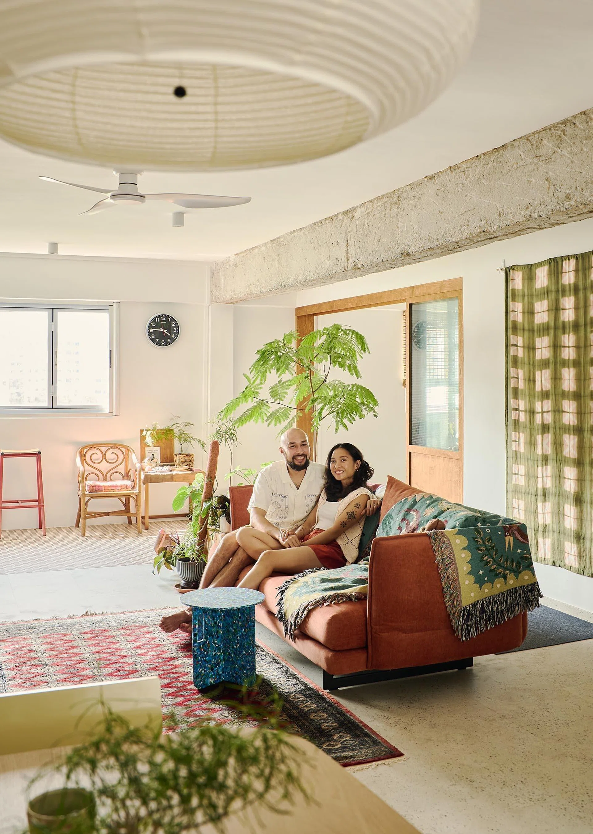
This 4-room HDB flat in Bedok North is where photographer Samantha Ngui and Timothy Wee, a design and photo lecturer have chosen to build their first home together. As one would expect of a home to creatives, it is an eclectic fusion of styles, materials and colours. There is an intentional randomness to the way furniture and objects are put together, but in no way haphazard and it gives the home a calm and cosy ambience.
Timothy, who is 39 years old and who has been an eastsider all his life, and 35-year-old Samantha were drawn to the good food and general vibe of the Bedok area. This corner unit from 1977 beckoned with its good bones and breeziness despite its age. During the viewing, their joy was infectious, lighting up their faces as they walked from room to room.
After they purchased the flat, the sellers shared with them that although there were many other potential buyers who were interested in the flat, they knew that they wanted Timothy and Samantha to have it as seeing the couple walk around the flat reminded them of their younger selves viewing the flat for the first time.
The vision and brief
The couple’s vision for their new home can be summed up in three words: playful, functional and mid-century modern. They were inspired by the Eames House, an iconic piece of modern architecture representative of the mid-20th century, designed by American industrial designers Charles and Ray Eames. They drew references from this era in terms of colours, finishes and materials such as raw ply, concrete and stainless steel, but were not fixated over it.
“There was no fixed idea. We simply chose materials and finishes that we liked, hoping that they would somehow fit together. We wanted the space to embody the ethos of mid-century modern whilst still feeling local and not Eurocentric,” says Timothy.
It was also important that the home be calming, light-filled and flexible, with minimal built-in furniture so that the couple can move things around in the future as their needs evolve. “Another point was that we also wanted to minimise material waste, so the size and heights of tiles dictated the size of spaces and surfaces,” Samantha highlights.
For interior designer Zane Mak from Studio Heiya, his approach was based on creating a space that would be the ideal backdrop for the couple’s curated furniture collection and personal keepsakes. He also intentionally introduced rawness and imperfections into the space.
“We avoided focusing on any theme or style specifically as we felt it would be limiting and restrict the overall freedom to be expressive with different colours and materials. We were happy to let the space take on a more eclectic design direction, due to the variety of items and furniture my clients wanted to feature around the home. We also wanted the home to radiate warmth and to have a lived in appearance,” says Zane.
Living room
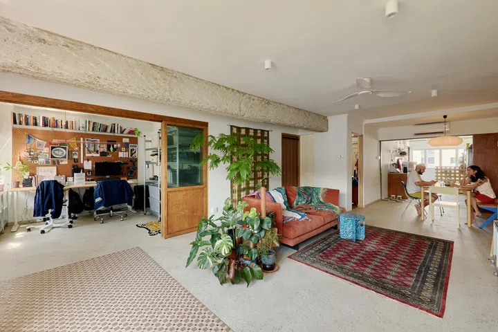
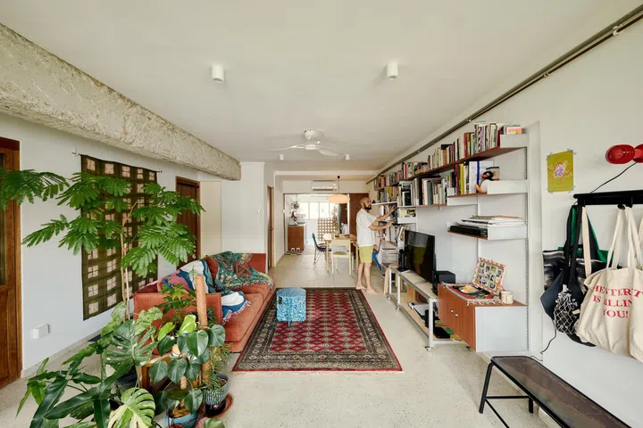
The living room is the heart of the house, part library, part gallery and also a space for the couple to watch television, chill and do yoga. They love the deep sofa that is extremely comfortable. “I take naps on it all the time. It has a longer vertical width that makes sitting cross legged feel comfortable,” shares Timothy.
“From the offset, my clients specifically mentioned that they were fond of imperfections in a home and that very much shaped the design direction we undertook. To showcase this approach, we decided to remove the outer layer of the living room beam to reveal the raw under layer,” Zane points out.
The exposed concrete beam also provides textural contrast with the smooth plywood that has been used in the living room and other parts of the home.
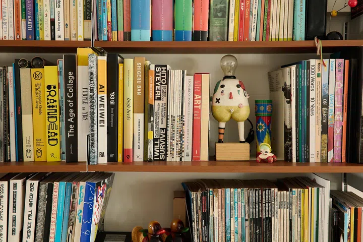
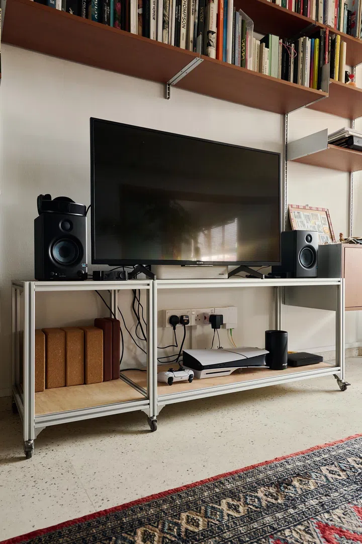
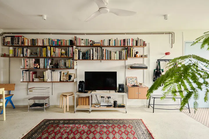
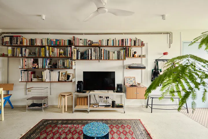
An open, plywood shelf stretches almost floor to ceiling across the length of the living room wall all the way to the dining room. It houses Timothy’s library of books and magazines, and Samantha’s collection of small figurines and ceramics.
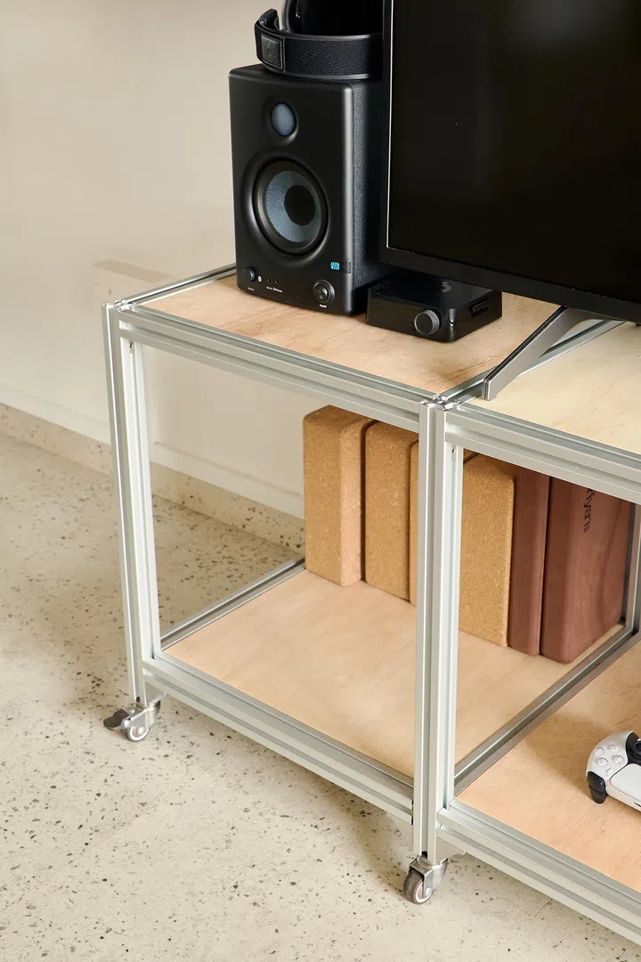
The couple appreciate the modularity of Vitsoe style shelving without the permanence, so that they can reconfigure and adapt it according to their changing needs.
Dining room
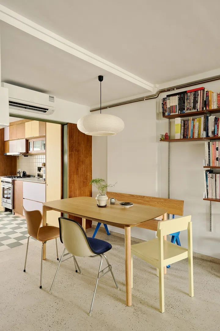
The idea was to have the shelving in the living room “dissolve” into the bench seat in the dining area, which blurs the boundaries and connects the two spaces.
The dining table was deliberately paired with an assortment of mismatched dining chairs that give the space an eclectic and laid back feel. A paper pendant lamp, something that the couple was very specific about, completes the space.
Kitchen and yard
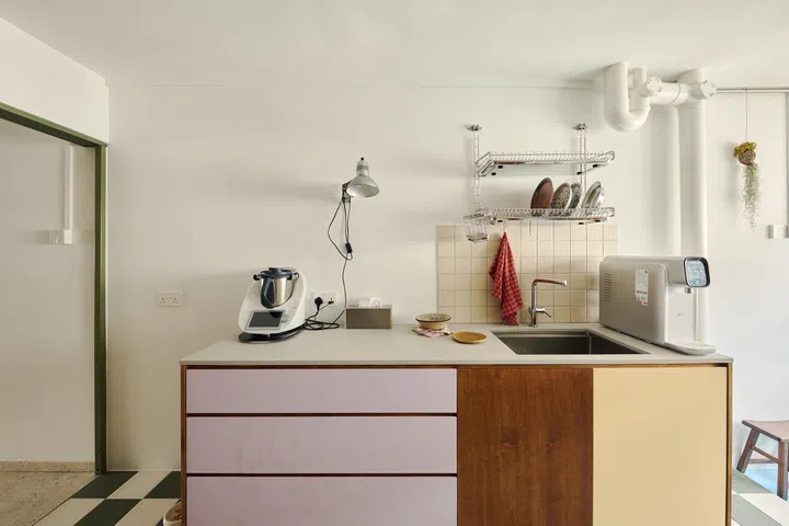
In order to achieve an unbroken line of sight, the kitchen floor was leveled with the rest of the home. A checkboard floor demarcates the kitchen zone from the rest of the home.
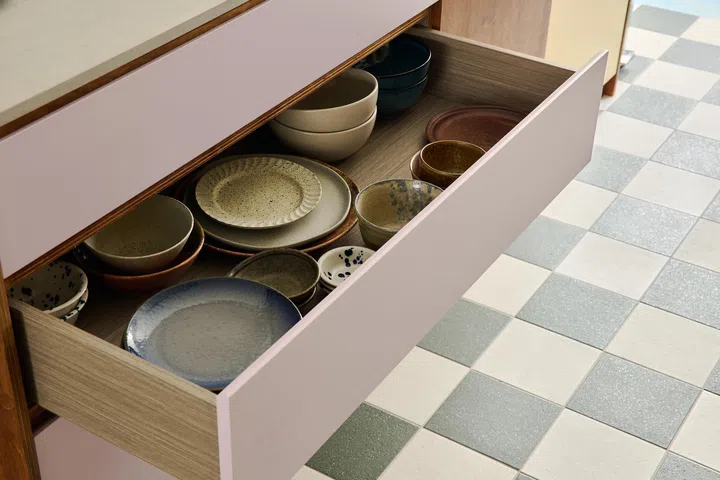
Materiality is an important part of the interior design through the combination of myriad materials and colours.
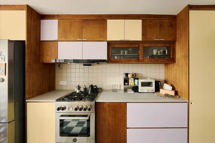
“Playful and unconventional colours like purple, yellow and green were intentionally used to bring a personal touch (Sam & Tim love these colours) and warmth into the kitchen,” says Zane.
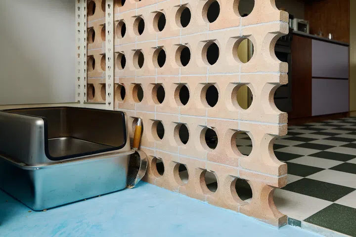
An interesting use of circular vent blocks can be seen in the partition between the kitchen and service yard. They add a retro touch and rustic aesthetics while remaining a practical choice in terms of promoting natural cross ventilation and light. The couple has also found an incidental use for the circular vent blocks- for hanging their kitchen towels to dry.
Master bedroom
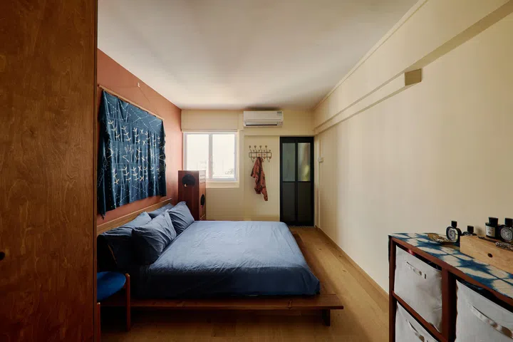
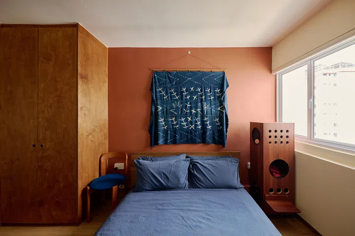
Deliberately kept minimally furnished, the warm colours in the master bedroom complement the full-height, built-in timber wardrobe. A low bed frame with a platform border all around doubles as seating.
Workroom
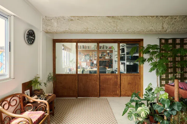
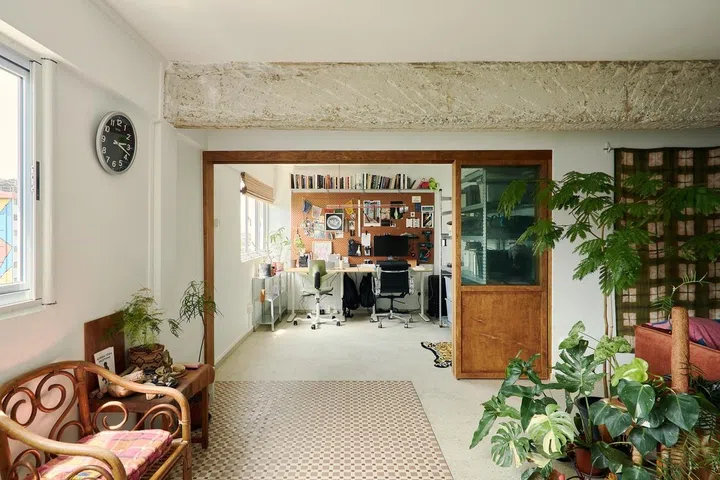
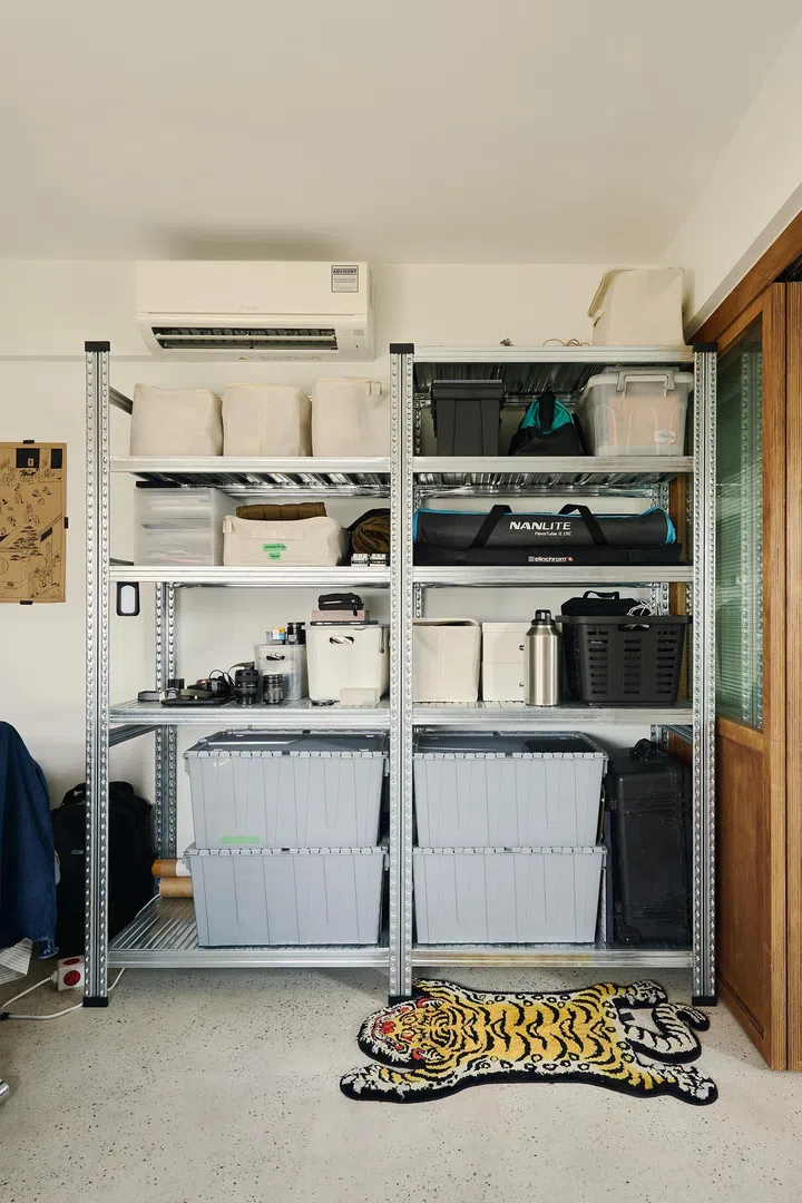
Located directly in front of the main entrance, the workroom is the first thing that visitors lay their eyes on when they enter the home. Sliding doors with glass panels on top allow the room to be screened off when necessary.
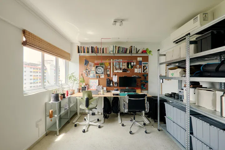
This space was designed for the couple to work side by side. Ample natural light makes it a conducive workspace, while a pegboard offers the couple the flexibility to switch things up whenever they wish.
Bathrooms
The master bathroom was enlarged to comfortably accommodate two persons simultaneously. Together with the common bathroom, the two areas are further examples of how colour has been introduced conservatively without being too overwhelming.
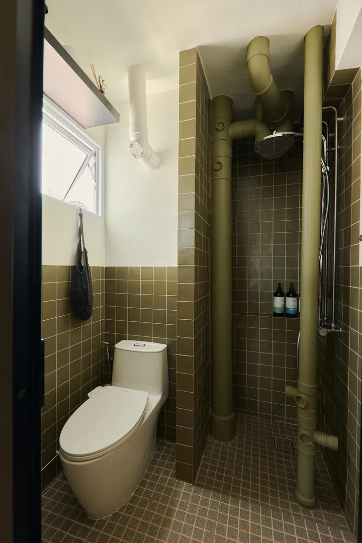
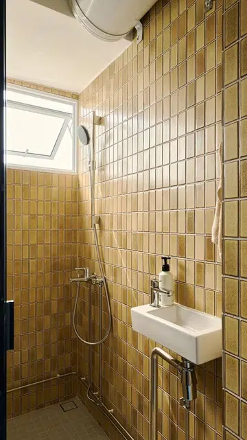
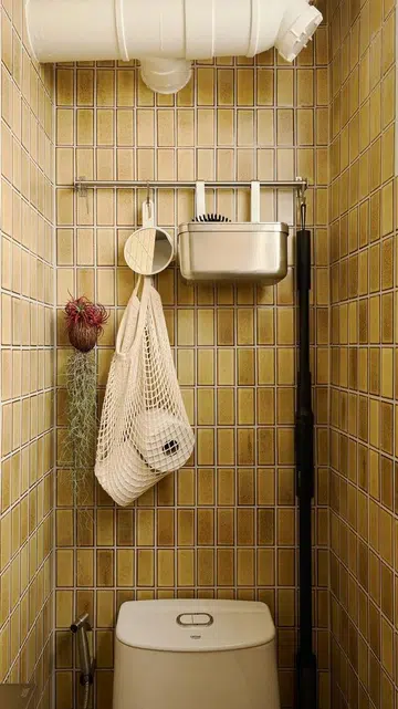
The master bathroom is decked out in olive green floor and wall tiles, while the common bathroom has yellow subway wall tiles paired with blue speckled floor tiles. Samantha loves the effect that it has on the common bathroom, which “glows when the sun enters every morning”.
$75,000 Renovation cost
The total renovation cost came up to about $75,000 excluding furnishing. This is a broad breakdown of the components:
- Hacking: $5,000
- Masonry: $26,000
- Carpentry: $25,000
- Plumbing: $3,000
- Electrical: $5,500
It took about three to four months to complete and the couple moved into their new home at the end of November 2025. The shared that people who have visited their home all commented that it is very “us” and they intend to live here long term. “The plan has always been for this flat to house us till it or we expire,” says Timothy.
This line from a poem by @msmoem that the couple loves sums up how they feel about their home: “So near or so far, wherever we are, no matter where we choose to roam, we live and we learn, but we always return; this is the place we call home.”