
Inspired by public spaces: An interior designer & wife’s $140,000 playful, industrial, retro 4-room BTO renovation in Bartley
“My home is an experimental ground for my ideas. Using materials not common on the local market, like Italian veneer or a fabricator in Shanghai.”
By Shannon Osztonits -
Share this article
The prototype home.
For this interior designer, homeowner and the founder of Place Poet, Bo Xue (BX), a perfect opportunity arose.
Creating a space to truly speak of his design ethic, style and inspirations – using his own first home as the blueprint. A place for him to bring clients. To showcase what he loves and appreciates in his design style and approach.
Would you not, perhaps, do the same?
Studying a degree in interior design, architectural philosophies like ‘Phenomenology’ have always clung to BX, guided by space perception.
“There is an architecture theory called ‘Phenomenology’. When expressed in architecture and interior design, it’s not just about the visuals; it’s the sound, touch, texture and scent. Simplified, it’s how one perceives space. How you want a space to feel,” he says.
The ‘Third Place’ theory and how it inspired the home’s industrial feel
Calling himself a selective extrovert, especially in his line of work, it’s clear when chatting with Bo Xue that he’s a deep-thinker too. His background in interior design and architecture heavily impacts his design approach.
Another example, and one the designer uses in his home, is ‘The Third Place’ theory.
“This theory is interesting and coined by an American sociologist. The first place is the home. The second place is your workspace, for example, your office. The third place is where communities and people gather outside of work and home, like cafes, coffee shops, bars, libraries, parks…I wanted to create that field in my place.
For example, the living room is modelled after a Japanese urban park. I wanted to bring in elements like concrete or gravel.”
The homeowner and his wife, Daphne, chose to integrate elements like stainless steel, wood in its most natural form, and other standard, raw building materials for an industrial edge.
“I am very inspired by public spaces,” tells BX.
Who Lives Here: An interior designer husband and a UX designer wife, both Singaporeans in their early 30s
Home: 4-room BTO
Size: 1,001 sq ft
Interior designer: Self-designed by interior designer and homeowner Bo Xue of Place Poet
The couple’s love for music and plants is easily noticeable throughout the home. Even though Bo Xue designed their home as a self-showroom, Daphne and BX’s personalities both still shine through. Comprising two bedrooms (master and guest room), the third room was converted into the wife’s study and her workout space. There are two bathrooms, a kitchen, and the open-plan living room and dining area.
Each zone captures the eye with unusual elements, like a glass-block feature wall or a self-designed glass ripple bench weighing 200 kgs.
Tadao Ando and a church
One of Bo Xue’s inspirations from an architectural and design perspective is Japanese architect Tadao Ando.
“A lot of his builds, even though they are concrete, cross paths with nature and the Zen aspect of a journey.”
Ando and this interior designer also share something else in common: a church. The famous Japanese architect is most renowned for his work on the Church of the Light project.
Coincidentally, one of BX’s first major projects that he worked on post-graduation was designing a church.
“I was the in-house designer for five years at the church I attend. It took about two to five years working with architects to get the building up. Afterwards, I worked with one of the church owners for his business and started designing retail stores,” explains Bo Xue.
“After 10 years of working – I mean, it has always been a dream of mine to start my own design studio – and gaining experience, I decided to try and fulfil this dream. Now, I’m into one year of running my business, Place Poet.”
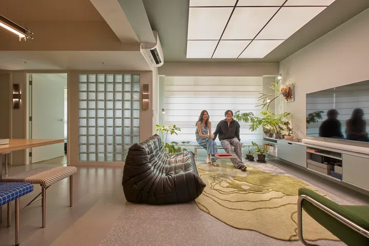
A sort of retro living room
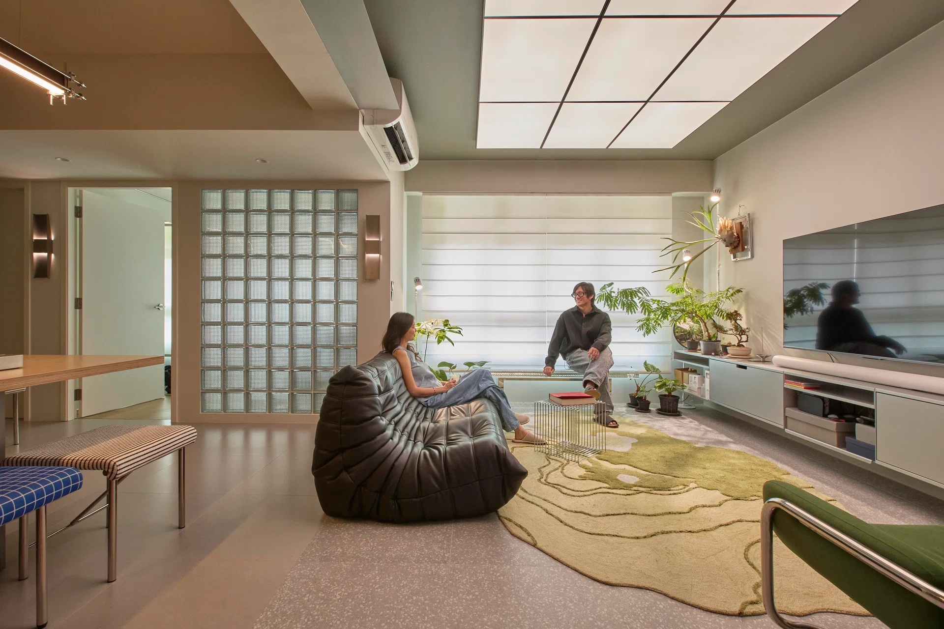
Lime green and natural light take centre stage in the living room.
Playing off of the homeowners’ collection of air plants, the designer’s appreciation for public spaces, and then an appreciation for chairs, this individual space is very distinct.
Looking up, Bo Xue installed a membrane light into the room’s centre ceiling – the same kind you see in Apple stores.
“They use it a lot to create soft lighting, and I like soft lighting a lot,” he says.
The interior designer custom-built the TV console, selecting this style for its metal look and thin lines. The living room is demarcated by terrazzo tiles, continuing around the corner to the front door and light-blue bomb shelter room.
“I selected this tile as it looks like pebbles in an urban park.”
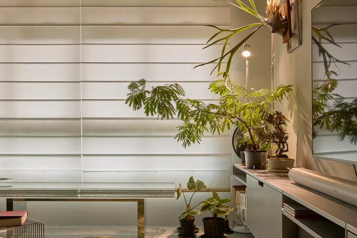
A green rug with topographic patterns and a groovy shaggy appearance reminds one of moss – its colour chosen to match the couple’s plant collection. With slight light blue patches intertwined in its textiles, these also remind the homeowner of water elements. A Roman blind made from rice paper lets the sunlight filter through, adding softness and a nature-like appeal to the living room.
Beneath this window is his reconstructed version of the glass ripple bench.
“I love how when sunlight shines through the glass, it refracts the ripple and looks like water,” he tells us.
Other designer-esque seats to appreciate around the living room include the black leather Togo sofa (chosen for low-seating appeal so the ceiling appears higher), and a metal and green occasional chair – which reminds me of a combination of the classic Wassily-meets-the-Womb Chair (by Eero Saarinen).
“I do like the Bauhaus movement, but I don’t have one favourite chair. For this space, I looked at the industrial period. At the moment, I am into retro chairs,” details the homeowner.
Adding to the room’s 1970s industrial appeal is a Panton wire mesh system-inspired coffee table, specifically chosen for its opaque illusion.
A light-diffusing glass wall element
Playing around with light and materials is a common theme in this house.
“Traditionally used on an exterior wall, it’s nice to bring into the interior as well. I used it to diffuse light,” says BX.
Whilst some designers opt for flat walls, this interior designer specifically chose the glass-block version for its ability to bounce light off of other spaces.
“This allows the natural light to fill up the inner space of the home. And why not just a flat pane of glass? That’s because on the opposite side is a stainless steel wall. With the weight of this material, it can feel heavy. So, I wanted a balance, therefore, choosing glass blocks to feel visually balanced.”
Tying into the balance are two stainless steel wall sconces on either side of the glass block wall. Behind this is Daphne’s study, and in front, the dining area. Directly from the line of the wall’s construction, Bo Xue employed a different tile to the living room’s terrazzo, using a smoother grey-toned tile to signal “stepping into a home.”
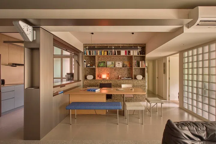
The industrial-meets-funky dining room
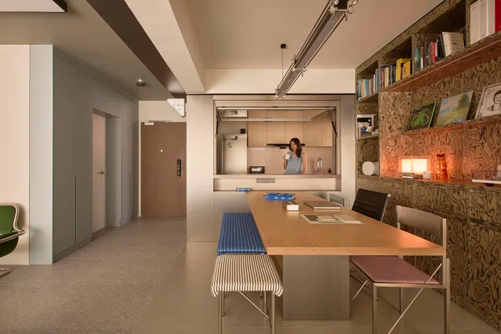
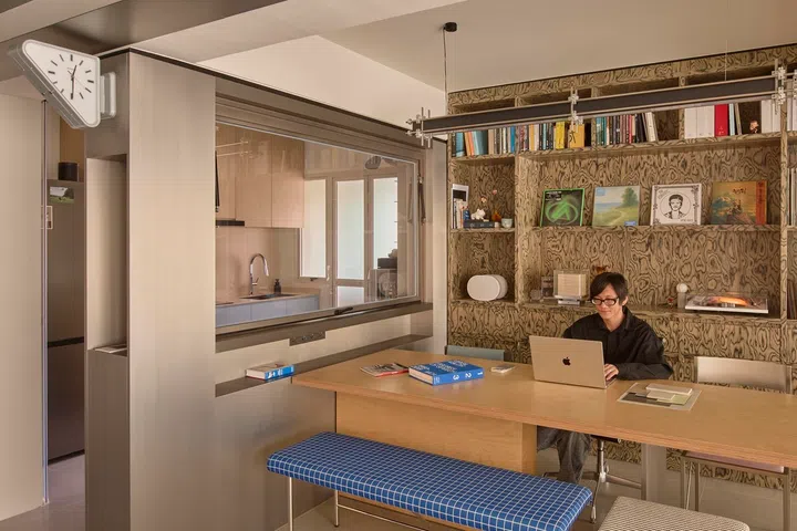
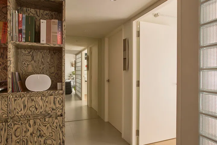
The shelves’ repeated patterns and wood grains, classic of that of Italian veneer, steal the limelight in the dining room – a space that doubles as Bo Xue’s workspace, where he’ll sit with clients or use as his home studio.
Nothing in its design is shelf-bought, including the birch plywood top and stainless steel-legged dining table.
“One of the legs is stainless steel; it’s not a typical four-legged table. It sits on one stainless steel point, and then the other one is almost T-shaped,” the interior designer explains. “Also for the counter, the way they stick together from the side profile, it looks like the layers of a kueh lapis cake!”
The mismatched checkered and striped benches splash up the scene with colour pops, selected by the homeowners for their chrome legs.
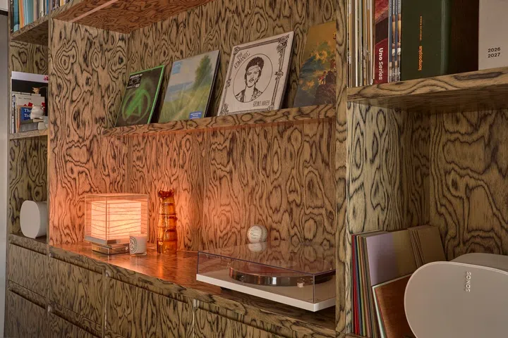
The custom-built shelf behind is a way for Bo Xue to reveal bits of his personality: his design catalogues, books and different reads, a record player with two speakers on either side alongside his records. Some weird-and-wonderful lighting and ceramics, a signed baseball, and more.
The Italian veneer he chose for this piece was sourced in Italy.
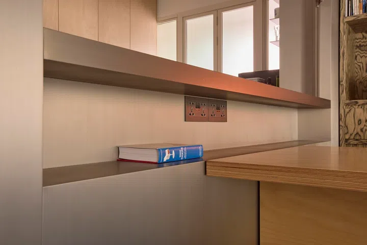
The stainless steel partitioning wall with its flip-up window
Between the kitchen and the dining room is a stainless steel partitioning wall, which the homeowner caught inspiration from after a trip to South Korea.
“I first saw a flip-up window in Seoul during our travels and loved how it opened up to connect with the space outside,” says BX. “I wanted to bring it in, but we don’t have it here locally. I found a fabricator in Shanghai and did it there, then brought it here and assembled it…I try to go for unconventional builds and love to explore new materials.”
On the side of the wall is a retro triangle clock reminiscent of an old-school train station.
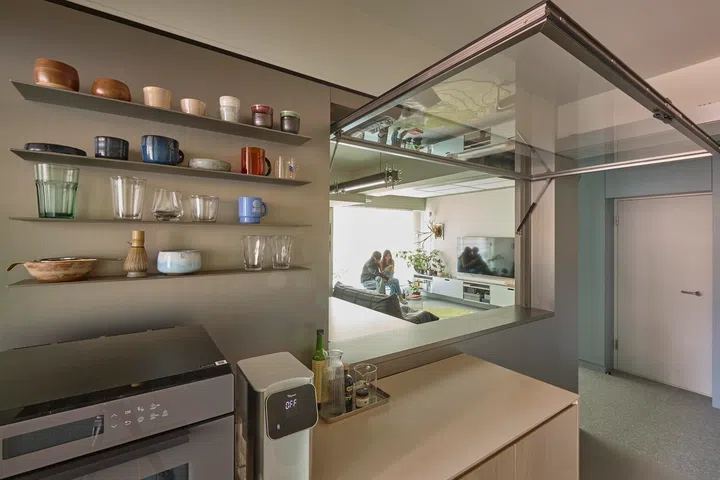
Even the kitchen has industrial marks
As the stainless steel partitioning wall doubles as one half of the kitchen’s, it instantly gives the compact yet well-equipped space some industrial flair.
Kitchen counters are sintered stone. Top cabinets are a wood laminate; the bottom cabinets are light blue laminate but with a similar wood-grain to the top ones. Daphne and Bo Xue’s choice of light blue was for consistency’s sake, streamlining pops of blue throughout their home – and to add some character.
Four thin shelves display the homeowners’ love for ceramics, and travels to Japan (which they do regularly).
Whilst this wife is a matcha gal, her husband is the coffee drinker.
“We travel to Japan quite often and collect little souvenirs. I love matcha,” says Daphne. “When visiting earlier this month, we visited an active volcano. Along the way to the top, there were different pottery stores where they use volcanic ash to create pieces, so we got some stuff from there. We have also crafted a few pieces in pottery studios in Singapore. We have a couple of matcha bowls, too.”
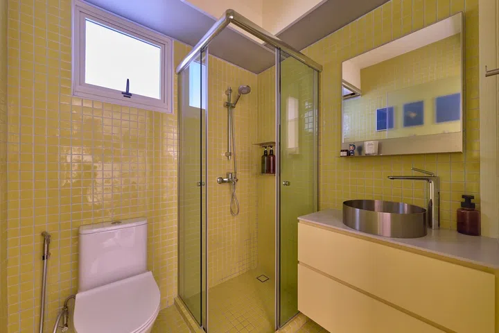
A butter yellow bathroom to make a statement
Instead of glaringly bright neons or dark shades, these homeowners have favoured playing with colour, but sticking to soft, lighter tones.
The guest bathroom is a delicious butter yellow, with a slight undertone of baby lime. They used yellow mosaics for the entire room, including floors, walls and the shower to achieve this look, and opted for a fun light blue grouting.
“In music, there is an interlude. I call this bathroom the ‘design interlude.’ It’s got nothing to do with the industrialness of the home. Instead, I wanted my guests to have a little surprise when they enter; a happy space.”
The vanity sports a stainless steel sink, aesthetically linking with the rest of this material in the home. The drawers are yellow with light blue wood grains. All intentional. This overall yellow shade matches the home’s light green tones.
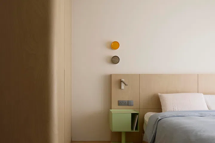
The primary bedroom and its green bathroom
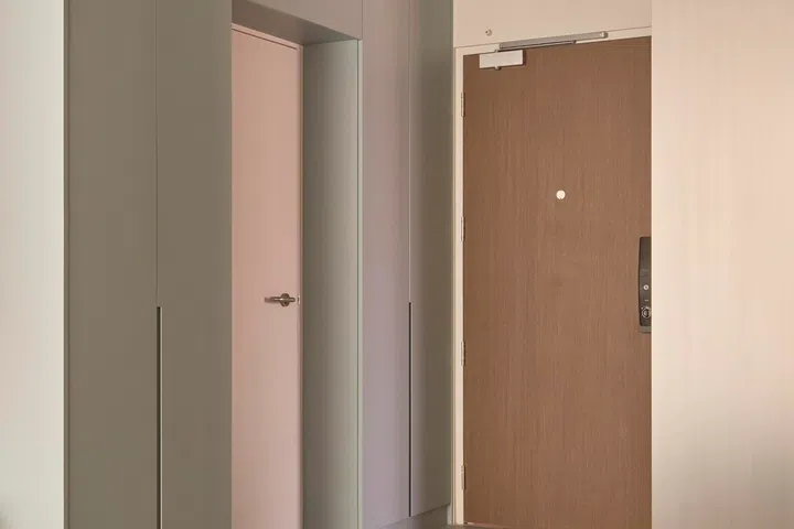
The one and only curve to feature in this home is as you walk into the master bedroom. Shaping the edge of the couple’s wardrobe, it’s close to the entrance and sets the tone for the room.
“As the home is industrial, I didn’t want many curves. It’s the only one in the entire house,” tells Bo Xue.
Matching the cupboards’ wood finish is the custom headboard, and the floors in here (as well as the guest room and Daphne’s study) are all wood vinyl to create warmth and a different look and feel from the other more industrial spaces.
“To add personality to our room, we each chose our own side table. Daphne’s is a light green metal, and mine is wooden and kind of looks like a speaker.”
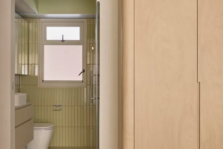
A reminder of bamboo, the primary en suite is decked out in light green kit kat wall tiles and beige ones for the floors.
“We love the Kyoto Bamboo Forest. Coincidentally, we are on the lower floor of this HDB, and when we open our windows, we see a row of bamboo!” The couple exclaims.
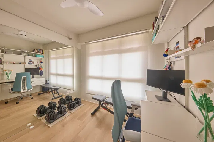
Daphne’s cute study-meets-workout zone
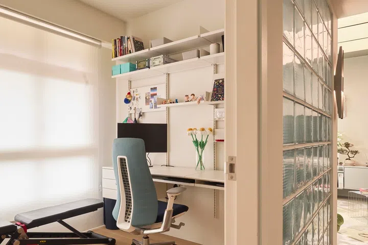
With a similar concept to the living room’s custom TV console, Bo Xue installed a flexible four-bracket unit for his wife’s desk setup. Decorating the space are cutesy items, like cloth flowers from Australian artist CG Hendry.
Daphne has an ergonomic blue office chair from Hayworth. On the opposite side of the room are built-in mirrors for when working out, as well as their gym equipment.
The experience as an interior designer working on his own home
With no need to employ an interior designer for this home renovation, all of the design concepts were Bo Xue’s.
“When it comes to how long the design process took, when we first got the floor plans, I had already started designing my home for about three years. For this home, I had so many interpretations: at least 16, but that’s because I am obsessed! The construction was about three months”