
This interior designer turned her 4-room BTO at Bartley Beacon into a personal design experiment
As an interior designer, Si Ling spends her days balancing clients’ tastes, budgets and practical needs. But when it came to her own first home, she finally had the freedom to explore the bold ideas she’d long wanted to bring to life.
By Gwyneth Goh -
Share this article
Every interior designer dreams of designing a home with complete creative freedom. For Si Ling, that opportunity came when she and her husband, Anthony, bought their first home together. Instead of becoming just another project, it became her chance to finally become her own client.
She approached the renovation as a personal design experiment, exploring architectural ideas, material combinations and spatial interventions that she rarely had the opportunity to realise in client projects. Concealed doors, lowered ceilings and carefully framed views shape a quietly dramatic home that balances everyday functionality with Si Ling’s distinctive design philosophy.
Who Lives Here: Anthony, 30, financial advisor, and Si Ling, 28, interior designer
Home: A 4-room BTO flat at Bartley Beacon
Size: 1,001 sq ft (93 sqm)
Interior Designer: Lim Si Ling, LXY Designers & Builders
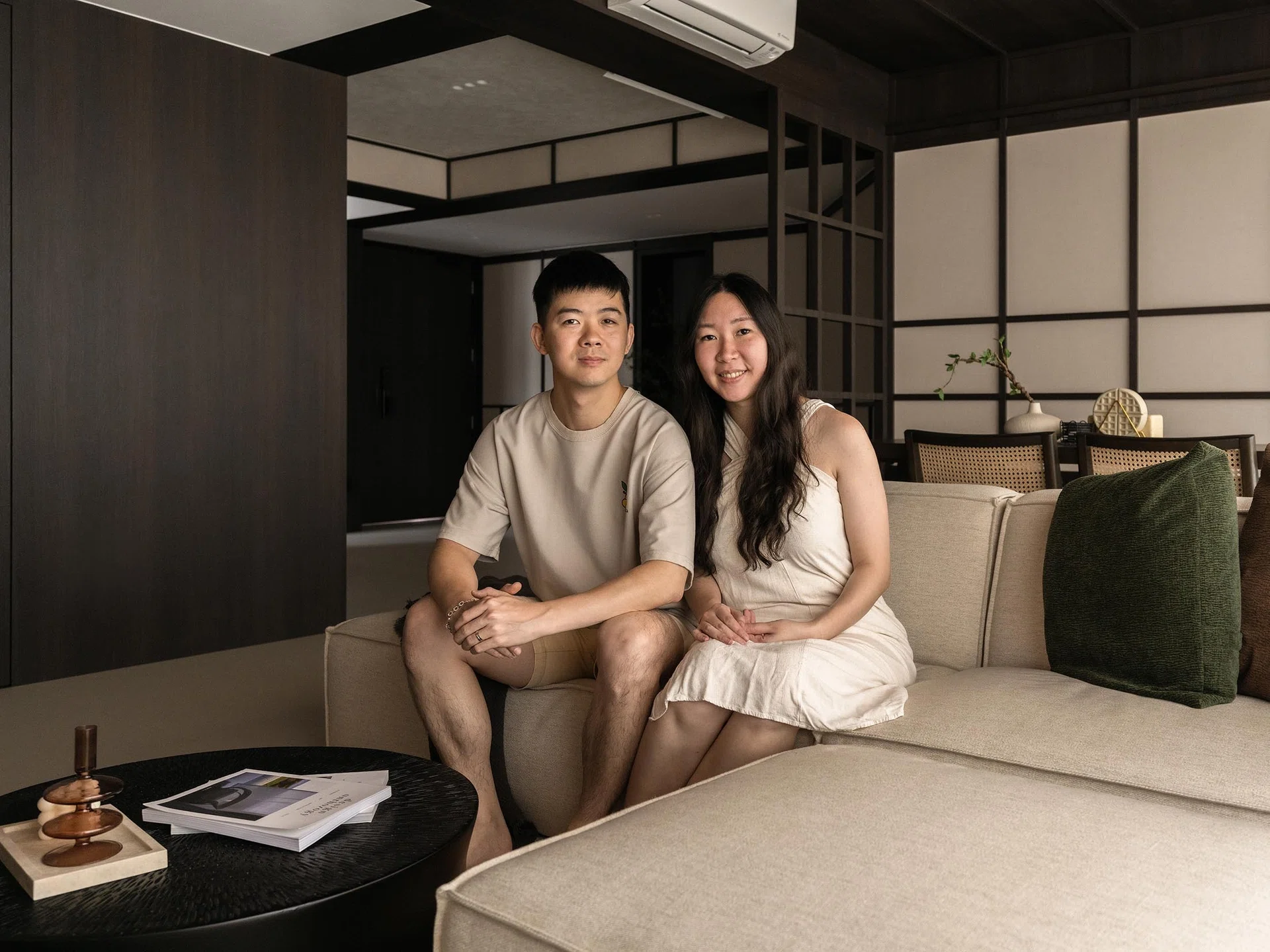
Si Ling and Anthony’s first home became an opportunity to create a space that reflects both their lifestyle, while giving Si Ling the freedom to finally explore her boldest ideas.
Finally becoming her own client
Every home is personal, but for Si Ling, her first home with husband Anthony carried an added significance. It was the one project where every decision, from the spatial planning to the choice of laminates, could be guided entirely by her own instincts.
“It was my canvas... to experiment with different things, like the use of contrast,” says Si Ling. “In Singapore, most clients are looking at budget, so for my own home, it was a canvas for me to do what I want to do—ideas in a way that my clients don’t have the budget to realise.”
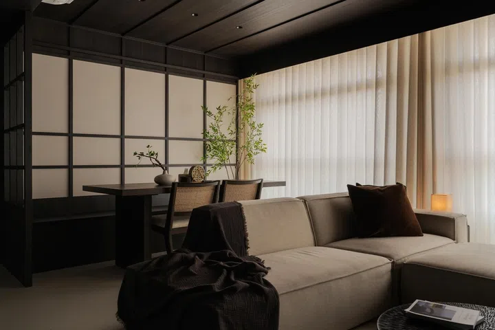
Breaking away from familiar formulas, Si Ling used the home’s communal spaces to establish a design language that was entirely her own.
That freedom also became an opportunity to push herself creatively. Rather than revisiting familiar ideas, Si Ling challenged herself to create something entirely new—even for her own portfolio.
“With every project that I undertake, I’m trying not to reuse ideas from past projects as much as possible because I don’t want to do two identical projects,” she explains. “Everybody is unique. I don’t want my house to look like my client’s house, and I also don’t want my client’s house to look like another client’s. I’ve done an extensive amount already, so I just wanted to break away—even from laminate colours.”
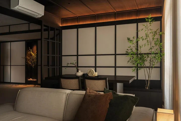
Si Ling used her own home to intentionally explore new material combinations, proportions and contrasts, creating a design language unique to this space.
The home that emerged reflects that mindset. Without relying on decorative gestures, Si Ling explored contrast, proportion and architectural detailing to create a space that feels quietly distinctive while remaining warm and liveable for the couple.
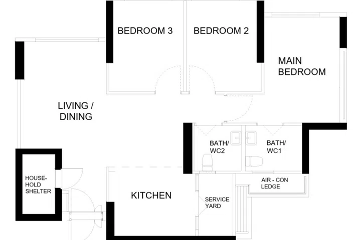
Original floor plan: A typical 4-room BTO configuration prior to renovating.
Reimagining a typical BTO
For many homeowners, a 4-room BTO flat follows a familiar formula: three bedrooms arranged around a central living space, each with clearly defined spaces. Si Ling and Anthony took a different approach, choosing to reshape the home around the way they live rather than the number of rooms they could keep.
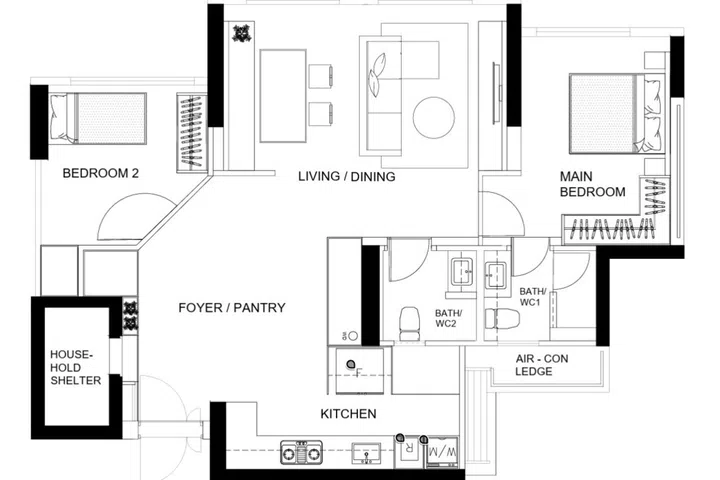
Final floor plan: The revised layout prioritises openness and everyday living, replacing one bedroom with a foyer and pantry while expanding the home’s communal spaces.
“We planned the layout based on hosting,” says Si Ling. “I’m a little introverted so I work from home a lot more, and I enjoy peace and quiet. Anthony is a little more extroverted and likes having people over. He wanted a bigger area in the house for hosting. We also enjoy playing mahjong, so having storage for it and a dedicated mahjong area was very important.”
As a result, the couple sacrificed one bedroom to make way for generous living and dining, foyer and pantry areas that support entertaining, while reorganising the kitchen into a more integrated part of the home.
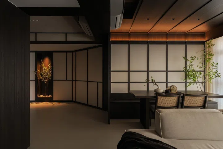
Removing the third bedroom allowed the couple to create a generous foyer and pantry that seamlessly transitions into the dining area—spaces designed first and foremost for hosting large groups.
Flexibility was another guiding principle. Without a dedicated study, the dining area was designed to adapt throughout the day—as a workspace, dining space and entertainment zone. “We wanted the layout to be flexible,” explains Si Ling. “If friends come over to play mahjong, we have a divider at the dining area. Although I can still hear them, it gives a sense of separation so I can still focus on my work.”
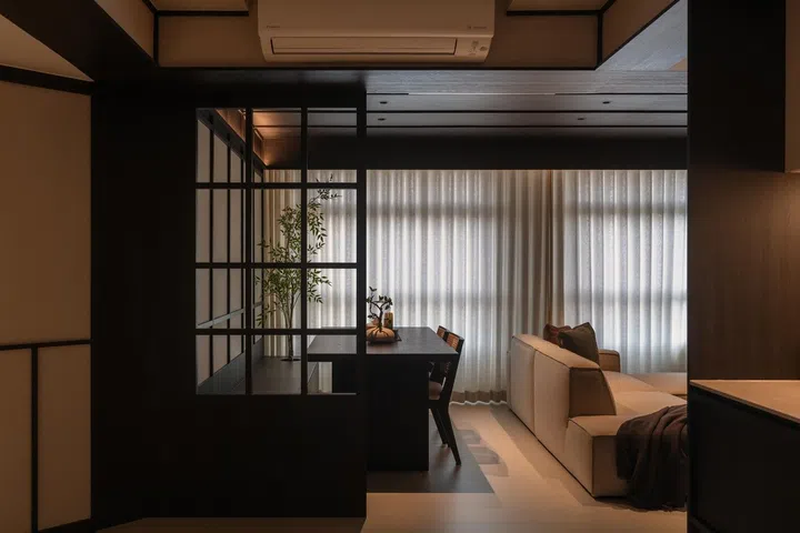
A Shoji-inspired screen subtly defines different zones, allowing the home to shift effortlessly between work, entertaining and daily living.
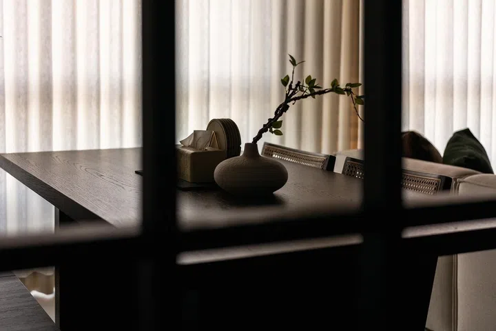
The divider filters views through the home, balancing openness with just enough privacy for work or entertaining.
That thinking extends beyond the floor plan itself. Layered ceilings, shoji-inspired partitions and continuous timber detailing reinforce the different zones while maintaining a cohesive visual language throughout the home.
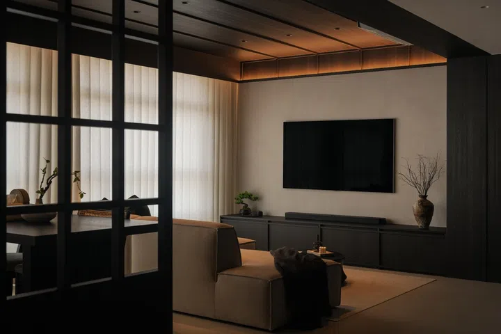
The home’s defining idea is contrast—dark timber ceilings and beams are balanced with pale walls, soft furnishings and natural light to create warmth without heaviness.
Designing with contrast
Reworking the layout may have been the home’s biggest physical transformation, but its defining design idea was much simpler: contrast.
“It’s just the word ‘contrast’,” says Si Ling. “Because Anthony’s and my personality are already a very big contrast. He wanted a darker house, while I wanted a lighter one. So I kept thinking about how to put these two things together.”
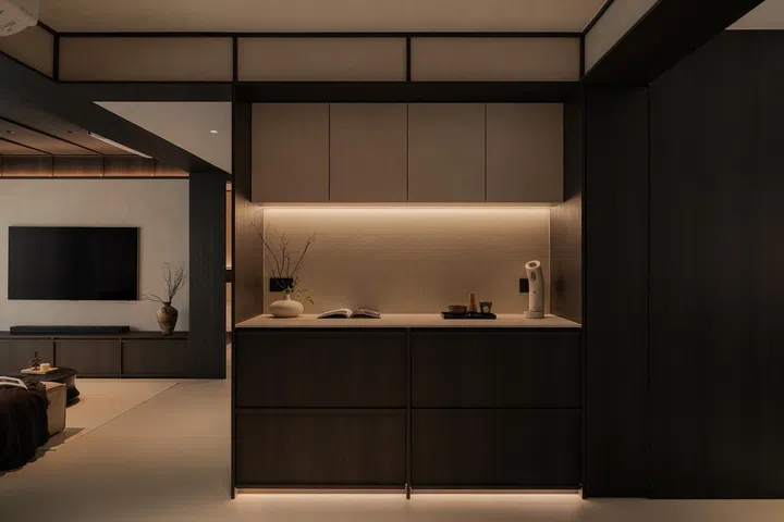
Dark timber continues uninterrupted through the pantry, visually connecting the communal spaces while reinforcing the home’s layered material palette.
The solution was to layer dark and light throughout the home. Full-panelled cream curtains, pale walls and large-format floor tiles brighten the spaces, while dark timber wraps the beams, ceilings and built-in carpentry. Together, the opposing tones create warmth without making the home feel heavy.
Anthony explains that the approach deliberately challenges convention. “If everything below was dark and everything on top was dark, the whole space would look very heavy and cramped. That’s why we made the walls light, but this is not something practiced by designers out there. This is something Si Ling has always wanted to explore.”
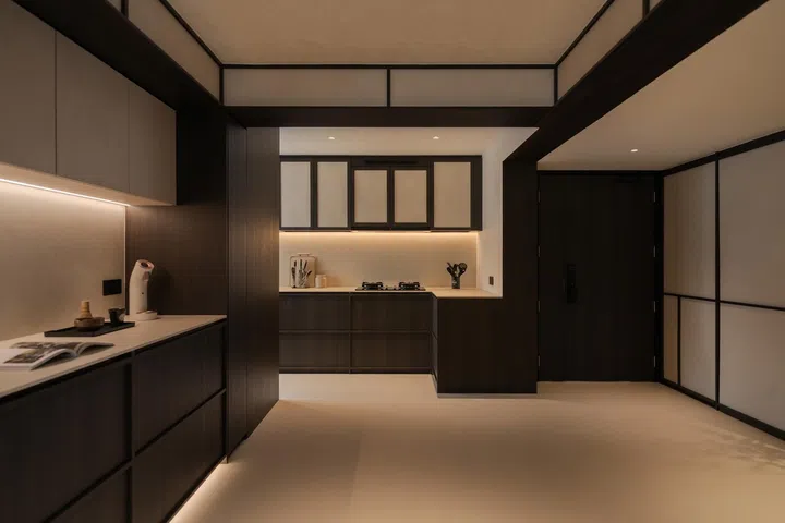
Si Ling intentionally lowered the entrance ceiling before opening the volume towards the living spaces, making the home feel more expansive through compression and release.
That willingness to experiment is perhaps most obvious overhead. While most homeowners associate high ceilings with spaciousness, Si Ling intentionally lowered the entrance ceiling to around two metres before gradually opening it up towards the living areas. The dark timber cladding continues across the beams from the front door, visually stitching the spaces together while making the reveal into the communal areas feel even more dramatic.
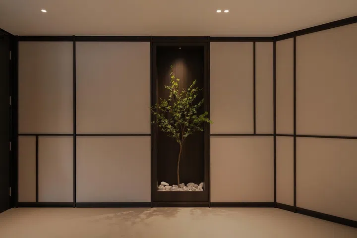
Large-format floor tiles with minimal grout lines create an almost continuous surface, helping the apartment feel more spacious while allowing the architectural detailing to take centre stage.
The same thinking informed the flooring. Instead of conventional tiles, the couple chose oversized 1.2m by 1.2m tiles with epoxy grout to minimise visible joints. The uninterrupted surface enhances the sense of openness, allowing the architecture and material contrasts—not decorative finishes—to take centre stage.
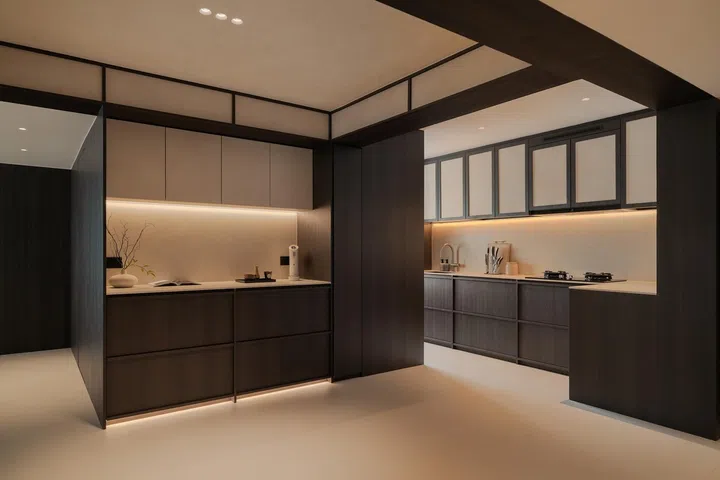
The original kitchen wall was removed to open up views across the home, creating an uninterrupted visual connection between the pantry, kitchen and living spaces.
Concealing the Everyday
Good design, for Si Ling, also plays out in the form of subtraction. It isn’t so much about what people notice, but what they don’t.
Visual clutter, in her eyes, extends beyond everyday belongings to the architecture itself. Beams, switches, door handles and bulky walls all interrupt the calmness she wanted the home to evoke.
“I don’t like beams and protruding things,” she says. “At the entryway and the corridor to the bathroom and master bedroom, we deliberately lowered the ceiling to be flush with the beams to conceal them.”
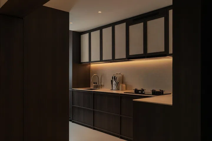
Viewed from the pantry, the kitchen remains partially tucked away while staying visually connected to the rest of the home—a balance between openness and order that Si Ling carefully planned.
That philosophy shaped countless decisions throughout the home. “Initially there was a kitchen wall,” recalls Si Ling. “We hacked it away because once you entered the house, that wall would immediately block your view. Even though it meant giving up storage, we wanted to be able to see everything at a glance.”
The same thinking shaped the dining divider. While the couple had initially considered a traditional shoji screen with rice paper, they eventually opted for an open framework that subtly defines the space without interrupting sightlines.
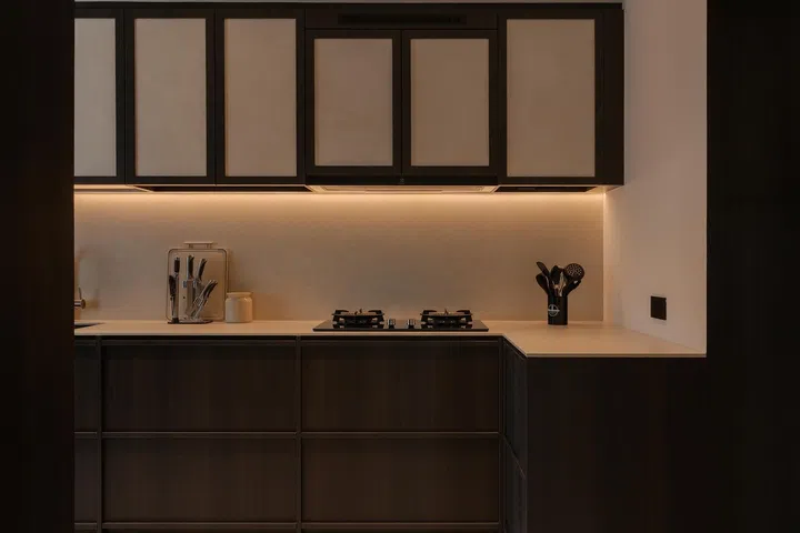
Clean-lined cabinetry and integrated smart lighting keep visual distractions to a minimum, allowing the material palette and craftsmanship to take focus.
“Our lights are also smart home. We don’t have any switches on the walls, to keep the clean look,” Si Ling adds.
Anthony believes these details are what give the home its distinctive character. “Without doors, doorknobs, or even switches on the wall, it gives the space a clean look,” he says. “All these are actually feature walls and carpentry.”
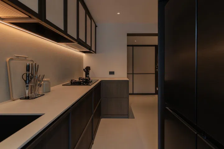
From the kitchen, uninterrupted sightlines extend all the way towards the foyer. Every design decision, from the removed kitchen wall to the open divider beyond, was made to create this sense of openness.
“It was more into the details and the workmanship and the carpentry,” Anthony continues. “So this was a showcase of the workmanship that her team can deliver.”
By concealing everyday functional elements within the architecture itself, the home feels quieter, calmer and more cohesive, allowing craftsmanship, proportion and materiality to take centre stage.
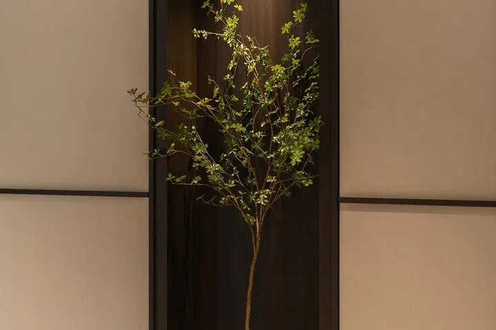
A recessed planting niche was introduced to break up the long run of linen-look laminated cabinetry in the foyer.
Designing for Tomorrow
Si Ling and Anthony were careful not to design only for the life they have today. Every space was planned with enough flexibility to accommodate the next chapter, whether that means hosting friends now or raising a young family in the years ahead.
“We tried to make the layout flexible for the lifestyle we currently have and the lifestyle we’re going to have,” says Si Ling. The mahjong area, for instance, is intentionally oversized not only for gatherings, but because she already imagines it becoming a play area for future children.
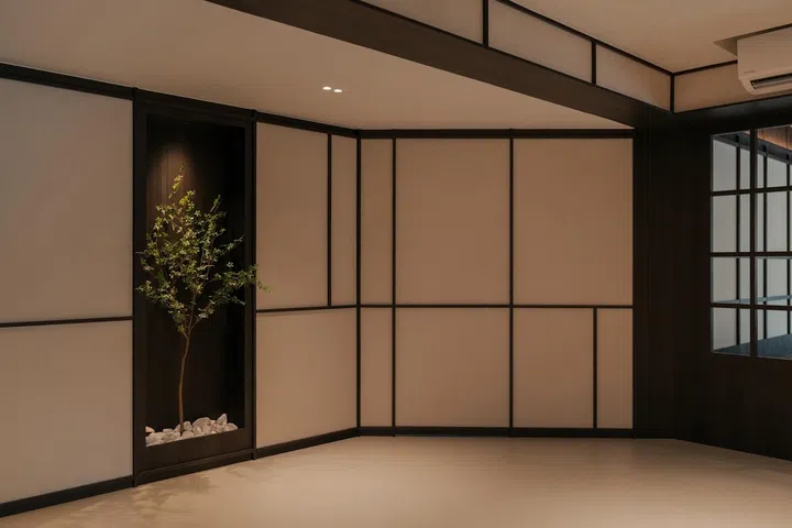
What appears to be a continuous feature wall actually conceals multiple functions, including storage, the mahjong cabinet, the bomb shelter entrance and even a bedroom door.
That same thinking extends to the home’s spare room. Instead of turning it into a dedicated study or gaming room, the couple deliberately kept the renovation minimal so it can easily revert into a nursery when the time comes. Anthony even planned practical details in advance, including a dedicated niche with power points for a bottle steriliser and baby appliances.
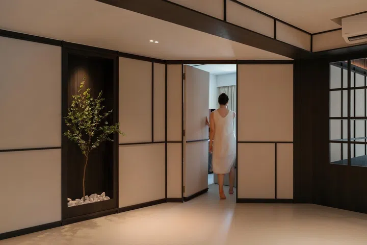
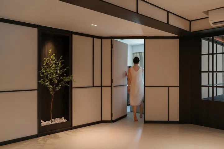
One of Si Ling’s favourite moments is revealing the hidden bedroom. Disguised as part of the feature wall, the flush door often surprises first-time visitors.
The home’s flexibility also lies in what visitors don’t immediately notice. Storage is tucked discreetly throughout the apartment, from the mahjong cabinet concealed within the entry wall to compartments beneath the dining bench and TV console. Even the bomb shelter, shoe cabinet, TV box and the common bedroom door disappear behind what appears to be a continuous run of wall panels.
“My proudest feature is the concealed room together with the concealed wall panels at the entryway,” says Si Ling with a laugh. “When we open the room for anybody, they’re always shocked. They don’t expect a room to be there.”
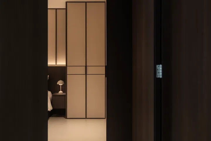
The master bedroom door is similarly concealed within the wall panelling, allowing the living spaces to maintain a clean, uninterrupted architectural language.
Quietly thoughtful details
After the highly considered communal spaces, the master bedroom adopts a quieter expression. “We kept the master bedroom rather simple because most of the time we spend in the house is in the living area,” says Si Ling. Without a television or decorative excess, the room becomes a place of rest, where materiality and craftsmanship take centre stage.
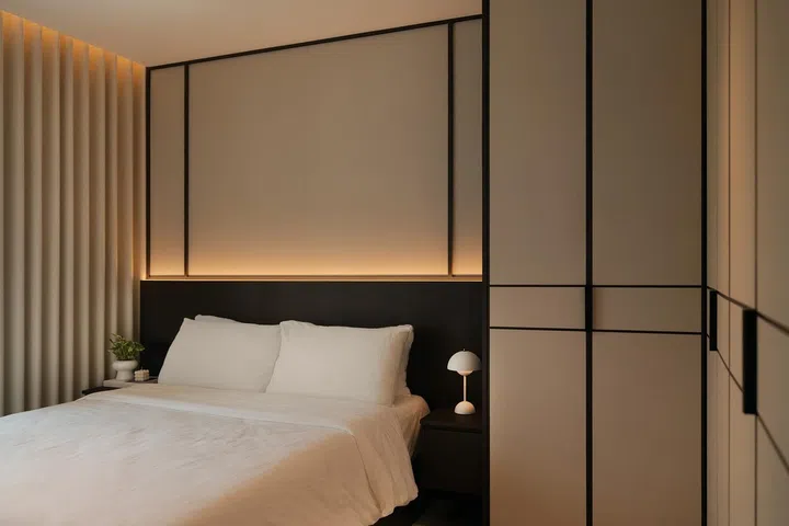
Without a television or unnecessary decoration, the bedroom relies on carefully proportioned carpentry, limewashed walls and soft lighting to create a calm retreat.
The same precision found throughout the home continues here. The bespoke wardrobes were designed to sit as close to the ceiling and adjoining walls as possible, eliminating the typical cabinet carcass to create a more tailored, almost built-in architectural appearance. “I wanted the wardrobe doors to be as close to the ceiling as they could get,” explains Si Ling. “It makes the wardrobes feel bigger and the space feel taller.”
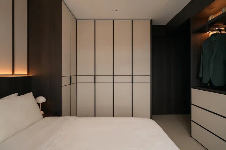
The bespoke wardrobes were detailed to sit almost flush with the ceiling and adjoining walls, giving them a more architectural presence while visually elongating the room.
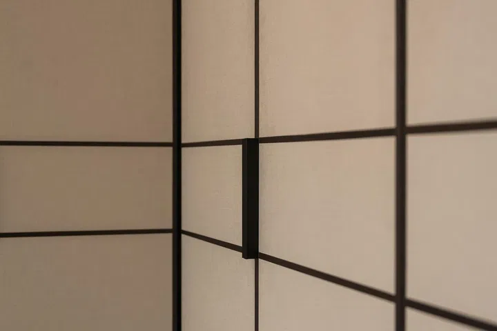
Custom recessed pulls are concealed within the wardrobe framing, remaining almost invisible from the front to preserve the clean, minimalist façade.
Even the smallest details were carefully resolved. The wardrobe handles are recessed into the slim framing, remaining almost invisible when viewed head-on while still being comfortable to use. Limewashed walls and softly illuminated headboard panels continue the home’s restrained palette, allowing subtle textures to replace ornamentation.
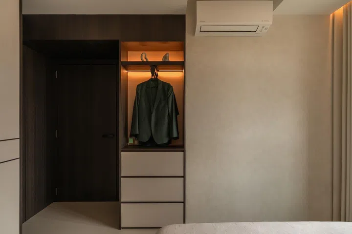
Instead of a chair piled with clothes, Anthony was given a dedicated niche for garments that have been worn but are not yet ready for the wash—a small but thoughtful detail that keeps visual clutter at bay.
Practicality, however, was never sacrificed. Instead of letting worn clothes accumulate on the inevitable bedroom chair, Si Ling designed a bespoke open wardrobe niche for Anthony. “Everybody has a chair where they hang their clothes,” she laughs. “I told him, no visual clutter—no chairs anyway. So I created this for him to hang clothes that have been worn but aren’t ready for the laundry yet.”
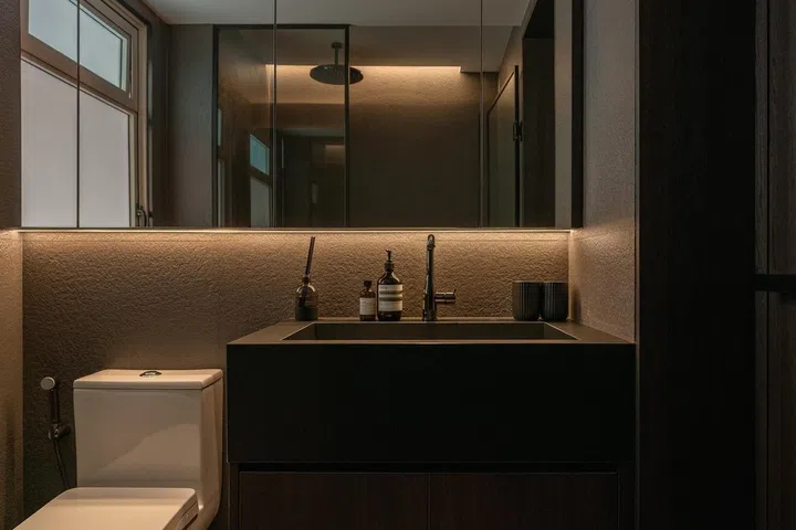
The master bathroom pairs textured walls with warm timber and concealed lighting for a calm, understated retreat.
A darker contrast
Throughout most of the home, Si Ling deliberately balanced light and dark to keep the spaces feeling bright. The bathrooms, however, became an opportunity to tip that balance.
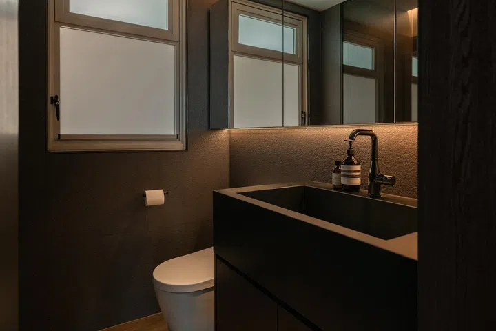
Its pared-back material palette and clean detailing reinforce the sense of quiet simplicity carried through the master bedroom.
“I rarely do black or dark bathrooms because I always tell my clients that soap scum will show,” she laughs. “But because the rest of the house is quite bright, I thought I’d do the bathrooms to Anthony’s preference. He wanted a more masculine house.”
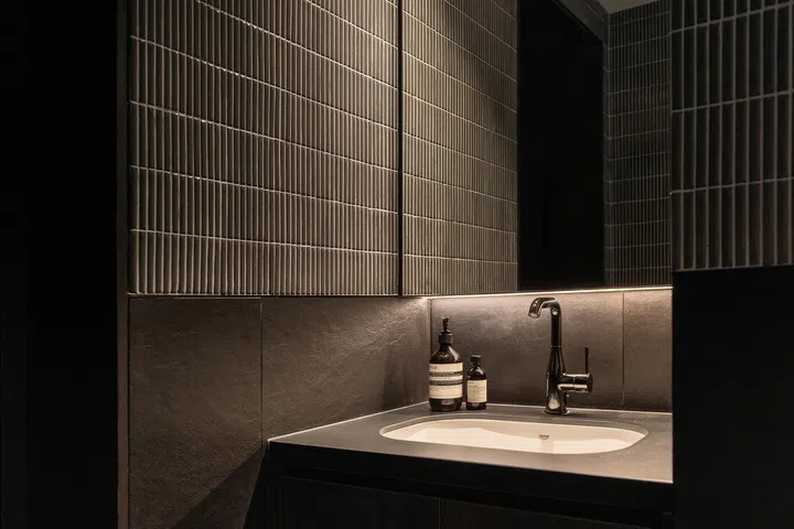
The common bathroom adopts a darker, more masculine palette—a deliberate departure from the rest of the home that reflects Anthony’s preference while standing up well to frequent use by guests.
The common bathroom, in particular, was designed with entertaining in mind. Since guests would be using the space regularly, darker finishes offered both a practical and aesthetic advantage. “When people go in and out, footprints or dirt aren’t as obvious,” explains Si Ling. “The common area is also clad in dark wood, so a darker bathroom feels more integrated.”
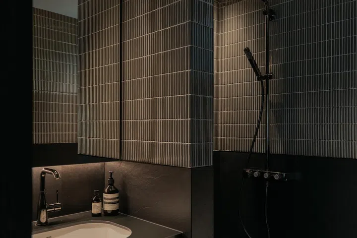
Dark ribbed tiles and black fittings give the guest bathroom a distinctive identity, while complementing the adjoining dark timber finishes throughout the communal spaces.
It is another example of the couple’s collaborative approach to the home, balancing design ideals with everyday practicality, while allowing each person’s preferences to find their place within a cohesive whole.
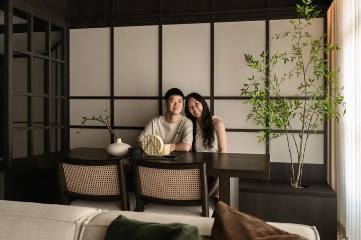
Having realised a home they wouldn’t change, Anthony and Si Ling now spend their time doing exactly what they designed it for—hosting friends and enjoying everyday life.
Exactly as intended
The home has turned out much as Si Ling and Anthony had imagined. Every decision, from the reconfigured layout to the concealed storage and carefully balanced palette, has been put to the test through daily life—and frequent gatherings with family and friends.
“I think we enjoy the space as thoroughly as we planned it,” says Si Ling. “Given the site and constraints, we did our best and really enjoy the house. We’ve been hosting a lot, and everybody who comes is amazed. They didn’t know a four-room BTO could be reconfigured this way. We’re very happy because that’s exactly what we intended people to feel.”
The couple have no immediate plans to move on. Although they recognise the flat’s future value, they designed it with longevity in mind. “We’re designing this space for at least the next five years,” says Anthony. “We wouldn’t say for sure that we’ll be selling and moving to another place. We want this place to be enough for as long as we’re here.”
Looking back, Si Ling’s first opportunity to become her own client gave her the freedom to explore ideas that might never have found their way into a client’s home. Yet the project’s greatest success isn’t the hidden doors, the reconfigured layout or the carefully layered contrasts. It’s that every decision has made the home work exactly as they hoped it would.
“It’s not a house just for the both of us,” Anthony sums up. “It’s also a house for our families to come over to gather, together.”