
Not your usual Singaporean style: $150,000 Renovation for a couple’s Clarke Quay condo inspired by Copenhagen’s Audo House
“We didn’t have a particular design theme or style. We just knew we didn’t want our home to look typical.”
By Shannon Osztonits -
Share this article
Ardo House, Axel Vervoordt, Kelly Wrestler, Soho House and Vincent Van Duysen…Throughout our interview with homeowners Frank and Gary, the couple mentions just a few of their favourite designers, creatives and architectural endeavours which inspire them.
These inspirations are some which led to the mindful spaces and design choices you see behind their 1-bedroom condo – which, by the way, screams luxurious design.
It’s the type of home you’d expect to see gracing the cover of a magazine.
Stones and rich colours play a major role in this home renovation, showcasing avid design enthusiast Gary’s ability to discern the good from the ugly. He spends his time scrolling and devouring the pages of design accounts and magazine pages. Musing over aesthetics, function and form. And it shows.
Very much involved in the conceptualising of every room and space, as well as every design choice here, this home exudes a certain kind of European-esque luxury that you don’t often see in Singaporean homes – especially condos which all tend to follow a similar layout. Forget about your traditional living room-dining room-kitchen. Japanese woods don’t exist here. Curves and arches aren’t a feature.
This house feels complete. It feels intentional. Sophisticated. It feels designer.
Who Lives Here: A Singaporean couple - a UX designer in his early 40s and a banker in his mid 30s
Home: 1-bedroom condo apartment in Clarke Quay
Size: 818 sq ft
Interior designer: Jeri from Studio Joon
A piece of marble that sparked the home’s entire design inspiration
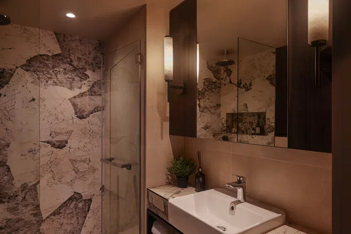
“Instead of a theme, we had words to describe the home,” says homeowner Frank. “Our key inspiration points were when we went to Hafary and responded to this type of Patagonia stone.”
It was this specialised stone that sparked the home’s entire design evolution!
Renowned as a stone that is visually very dramatic, adding a lot of depth to whichever space it’s utilised in, and with unique greyish, browns and cream patterns, the couple decided to use a bold slab for both their master bathroom shower feature wall and the kitchen island centrepiece.
“There is the bathroom slab and then the island. The bathroom version is sheen. The kitchen is more matte. There was something about the stone that spoke to us. Gary watched a lot of YouTube videos, and he researches designs he likes, which all have a very European aesthetic. He’s good at refining the restraint in the house, and I would suggest using some kind of pattern or elements to inject a bit of interest.”
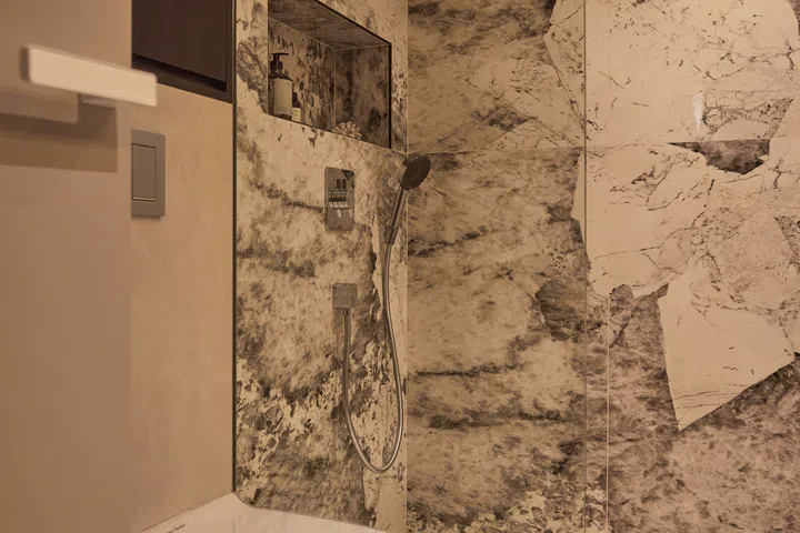
Once the homeowners settled on a key “noisy” element, they opted to show more restraint in the rest of the home’s overall design concepts. Using a few repeated subtle materials throughout the rooms further adds to this. For example, the alabaster wall sconces used in the bathroom are similar to those in the kitchen.
Great taste and a good eye for stylish furniture
Some people are just born with good taste. It’s as simple as that. It’s not something that can be taught. It’s what sets the greats apart from the ordinary.
“Gary specialises in finding amazing hotels and accommodation,” informs Frank.
A good eye is a good eye.
Designer chairs decorate various rooms, including an animal hide-covered Wassily-like number in the living room and the primary bedroom’s occasional chocolate bouclé corner piece.
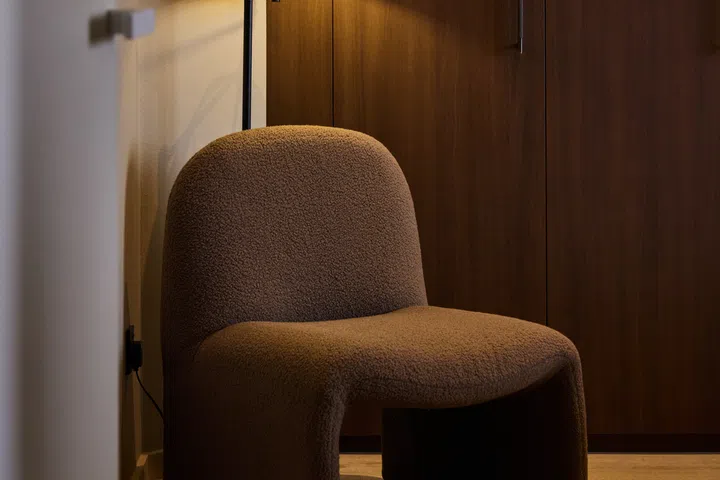
“I do love chairs, and these are very classic designs and quite timeless. One thing, when I was selecting furniture, we didn’t want things to be too trendy in a sense that five years down the line it feels outdated,” says Gary. “It costs money and doesn’t add that much to the property.”
“Our hope was that we can move these pieces to a new place if need be,” chimes in Frank.
“Also, another thing I noticed is that a lot of times, our friends don’t have enough chairs and people resort to sitting on the floor, and I just didn’t want that,” continues Gary. “So we have a lot of chairs, whether it’s the bar stools or designer chairs lying around.”
A kitchen that is timeless with raw and elegant finishes
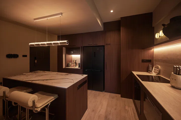
Gary was very certain of the home’s nitty-gritty design specs – sourcing and mock-ups included. Yet there is one thing that Frank was set on for their abode: the kitchen island.
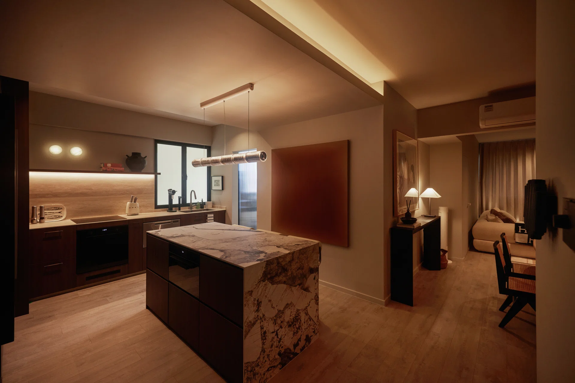
“I specifically wanted an island as a centre of attention kind of piece for the kitchen,” Frank details.
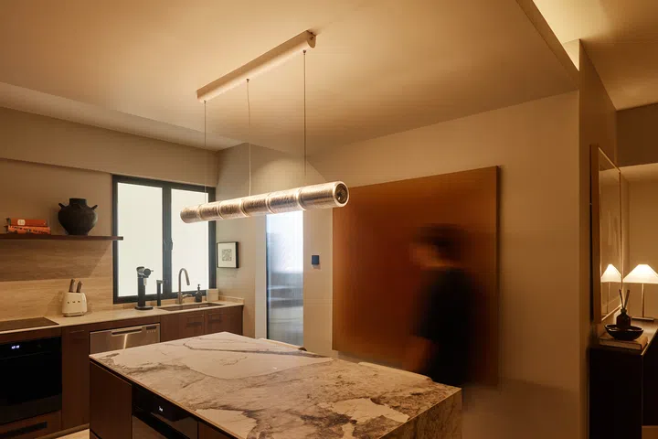
Built into the island is a microwave below, and above, a single metal linear pendant light. It adds just the right amount of contrast to dark walnut coloured laminates (and their slight grey undertones) without being too obnoxious. Kitchen countertops and backsplash are sintered stone. The kitchen floors, as well as the living room and dining area, are all the same vinyl for a single apartment living feel.
Completing the space is a commissioned deep red piece of artwork reminiscent of a Rothko.
A rich-feeling dining area thanks to one key element
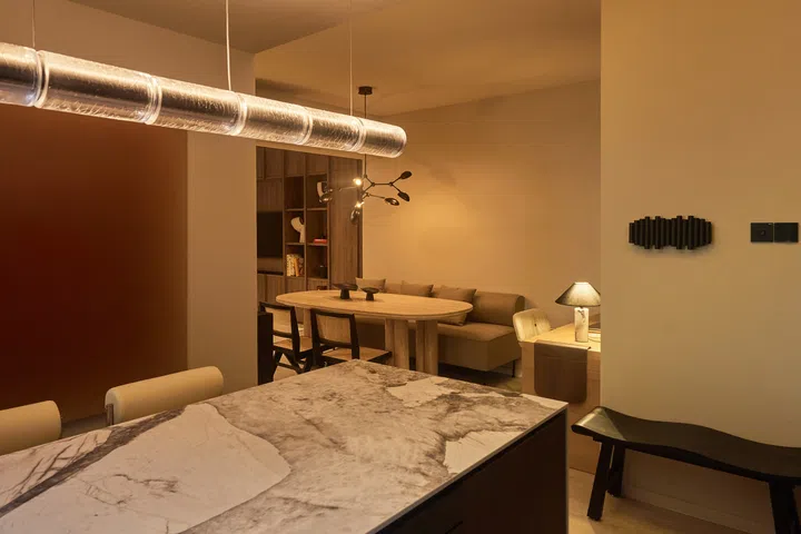
A banquet sofa instead of regular dining chairs? This instantly adds an element of luxury to the dining area, which is located between the kitchen and the living area.
The travertine dining room table is a statement piece in its own right; each one of its legs weighs a whopping 75 kg. Opposite the sofa are a set of rattan chairs.
“I was thinking to myself that if you have chairs on the sofa side, it cuts off the space around how far back to place the dining room table, as you have to pull the chairs in and out,” tells Gary.
“No, Gary is selling himself short,” adds his partner. “He did a lot of research. He looked at a lot of magazines.”
“Yes, I really like the banquet-style, and I didn’t want too much built-in furniture, so we bought the sofa.”
In front of the dining table is Gary’s study area. Take note: small decor features such as a marble base reading lamp enhance the richness of this home in simple, subtle ways.
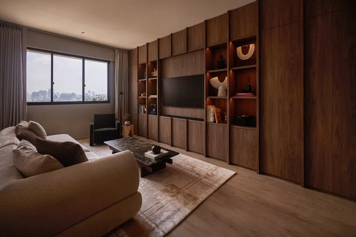
The Audo in Copenhagen-inspired living room
Now known as Audo House, the iconic Copenhagen designer hotel-meets-design hub (formerly The Audo) was Gary’s muse for the living room concept. It’s a dreamy location to explore for any other design aficionados; a place where you could spend hours milling over its collections and design set up in a historical Danish building.
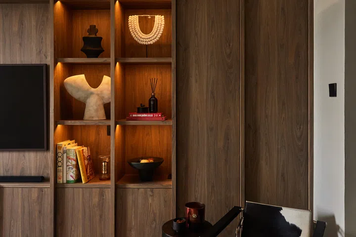
If you’ve ever visited the creative space, you’ll instantly notice the subtle nods and similarities, such as the straight-edged marble coffee table in Gary and Frank’s living room, the soft and minimal yet plush Scandinavian-type sofa, and of course, the custom-designed full wall display unit where the TV sits.
“We didn’t have enough storage as this is a one-bedroom, but not a typical one-bedroom with a storeroom. So we wanted more. On top is storage and the shelves below. We also didn’t want to just buy a TV console and chuck it there in the middle of the room’s wall. The living room is fairly long at 2.5 meters. If we had a TV console on one side, the opposite wall would look bare,” says the homeowner.
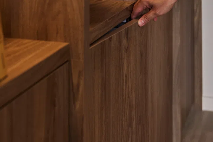
The unit is constructed in a lighter walnut colour compared to the kitchen to avoid things being too “matchy-matchy.” The entire room exudes a stylish warmth because of this feature wall, which also displays ceramics, design books and beautiful decor.
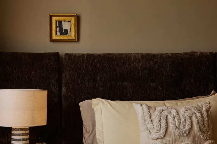
The bigger the better master bedroom
Whilst this master bedroom isn’t overly sized, the couple didn’t skimp out on furniture selections, opting for bigger-is-better sizes, like the headboard which extends across the entirety of the wall, the king-sized bed and the full custom-built cupboards across the opposite side.
“For the headboard, I like the fact that the panels can actually turn out. I like big furniture; it adds to the illusion of luxury,” Gary informs.
On either side of the bed are fluted walnut bedside tables with brown emperador marble tops.
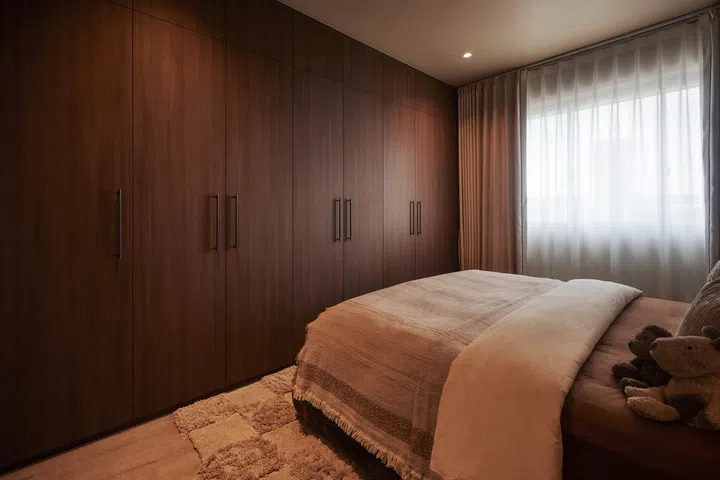
The checker block carpet and occasional chair in the master bedroom add more warm textural elements to the space.
The convenience of the Clarke Quay area
This couple loved the convenience of the Clarke Quay area, with the CBD on one side making work commutes easy, as well as the fact that many of their friends live around here.
“Before, we had to take public transport to meet friends for dinner. Now, my gym is literally downstairs, and his is 10 minutes away,” explains Frank. “This area is great for hosting friends for dinner, or they can just drop by.”
“The location is also very strategic; one that faces the CBD and the quay and the other view is the Singapore River, Clarke Quay and Fort Canning Park. And because these are all conservation properties, the view is going to stay unblocked forever,” says Gary.
In total, the homeowners only viewed two properties before deciding that they wanted to buy this place. Gary was drawn to the condo for its high ceilings, and he could just imagine creating a certain kind of vision here.
Also, the property’s atypical layout was another selling point.
“So many condos have the same cookie-cutter layout, especially with new developments. They’re always so small, and you don’t have room to play around with anything. All of the homes end up looking the same, with a small sofa, small chairs and a tiny dining area. There were a lot more options here to design and space we could play around with.”
Design works were finalised within two months, and the construction works took four months to complete as they extended over the Chinese New Year period.